
Graphic designer Ana sent me an email saying, “I have been working as a freelance graphic designer for over 20 years. When I’m working on a logo, I can spend HOURS browsing through fonts looking for inspiration.”
And you know what? This isn’t an isolated situation. We hear this frustration all the time. This type of work comes up often among the Varsity Team members.
Graphic designers spend a lot of time trying to figure out where to start with pairing typefaces to symbols.
As a matter of fact, I’ll never forget my first freelance product logo with then-client Canon Business Machines in which I logged over 120 hours in designing. I remember staying up all night looking at logo books and scrolling through the font palette, not knowing where to start.
I couldn’t bill them all those hours, so I lost my big on that project. Instead of making $1,500 on that logo, I probably lost $1,500. I guess Canon paid for my education. And it didn’t even turn out that great.
What went wrong?
First of all, I didn't understand how important type was. I was focused on the symbol, and was using the letterforms to fill in space.
I assumed that great logos were all about the symbol, and the company name didn’t matter. On most logos, I didn't notice the type. I realize now that is the one thing that demonstrates good typography.
I was referencing bad logos. I didn't know what was good at the time. I had zero guidance.
Have you ever known someone to design their own logo? Or commission their cousin or secretary because they had Adobe software? Those logos are all over the place. Uninformed, unfocused and amateur. Now that I look back, I see the answers were easy to find. I should have studied the masters.
I didn't know what the look for. I didn't realize that classifications and characteristics were important to understand.
Typography fundamentals matter. Even in logo design. Especially in logo design. When you're building a visual communication tool that will be used by a company for upwards of 10 years and placed on everything from a side of a building to the surface of a golf ball, those fundamentals matter.
Want to save some time finding core typefaces for logos? Michael and I address this issue and provide some guidelines in this video recorded during one of our monthly Alumni Calls.
First watch the video, and then I want you to take a minute to test your pairing skills.
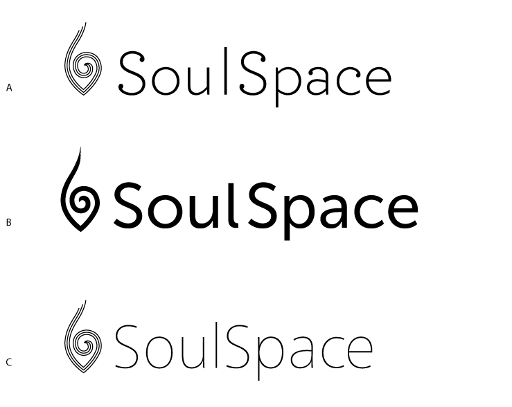
Soulspace was a client of ours, a Hawaiian yoga sanctuary, in which we developed a few early logo directions for.
Take a look at these three directions, and look at the symbol and the type. What do you notice?

Let’s see if you can decide which of these three logotype variations work best, and why.
Don’t say which one you LIKE the best, because when it comes to design, it's not about what you like, it's what works to communicate visually.
So, in your opinion which works best? A, B or C? Leave your comment here with your best guess on which one works, and state why you think so.