
Just like a smooth cup of coffee or a cozy warm blanket, a beautifully-set justified paragraph… just feels... so… right.
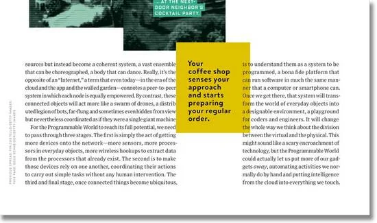
Just look at this article from Wired.

Damn, those blocks of copy are super sexy. And not a river in sight.
What are rivers? They are the unpleasant spaces between words in blocks of copy. You can find them in poorly-designed books and magazines. And if you squint your eyes, you can see white lines flowing in-between words down the page; yup, those are rivers.
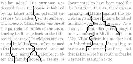
Rivers make content difficult to read because our eyes have to jump from word to word. And it’s very difficult to concentrate on a story when you’re searching for the next word.

Use rivers, and the overall horizontal rhythm is compromised. Instead of a smooth, fast, performance-based ride along the sentence, the reader has to stop and start constantly, just to get through the rest of the story (see irregular rhythm, above).
Rivers are indicative of something that was producing too fast, aiming to get the content out as soon as possible (like a daily newspaper), or disregarding design (low budgets or unaware designers). Rivers evidence lack of empathy for the reader.

Do you see the rivers above? If not right away, it may take a little while to notice. For instance, in the first column... fifth line down, reads “words accomplished.” That line has a huge ol’ gap between the words.
We see those gaps so often that we are accustomed to them, but they still interrupt reading. Once you see them, OMG you can’t unsee them.
How can you avoid pesky rivers and set balanced blocks of copy?
- Always use hyphens. Using hyphens in your body copy will minimize rivers in your justified blocks of copy. In left-aligned copy, using hyphens will help to smooth out the rags.
- Keep your line lengths on the longer side. A comfortable length is 50 to 70 characters long, but if you have to go shorter, be aware that the gaps between words will widen.
- Hang your punctuation. Quote marks, hyphens, and periods should lie in the margins and alleys, aligning type to type and creating a visible box of type.
Do balanced blocks of copy matter to the reader? They don’t.
What DOES matter to the reader is a seamless reading experience. Beautiful blocks entice people to read. And type set well will help to amplify the voice and tone of the content in the reader’s head.
What does a distracted reading experience look like? See examples of typecrimes on Twitter.
I believe that there are clients who need your help right NOW to amplify their content to reach readers and help people. They cannot do that without your typography know-how.
You can help your clients grow their businesses and organizations by designing seamless reading experiences that audiences love.
Do you want the fundamentals? We cover horizontal rhythm in our online Type 1 Class; alignments, spacing, and weights are explained in Type 2 Class. Or visit us in the Los Angeles area and learn in-person.
But if you want to actively transform your portfolio and skills to demonstrate seamless reading experiences; schedule a call with me and let’s talk about how we can help.
Whatever path you choose to pursue learning, make sure it leads straight to your goal; whether it’s designing identity systems, improving typography for bloggers, or getting larger client projects. You don’t have to waste years, you can get there in a few months with the right game plan.
Now, what’s not to love about that?