

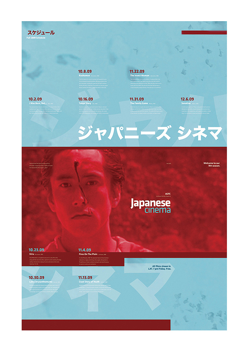
In high school, Erik Molano learned how to create basic shapes and text layouts in Adobe PageMaker and Corel Draw. As a graphic design student at Art Center College of Design, he primarily focused on typography and branding, and then shifted his concentration toward design for social impact. He is fascinated to see how the design process could be used to solve complex, interconnected problems like eradicating homelessness and improving education. Erik shares with us his student project promotional poster for the Art Center Film Club's Japanese Film Series.

What about Los Angeles has influenced your work on this project?
I would say that cultural diversity is one of the best things about Los Angeles. At Art Center, students come from all over the world, and I was really lucky to have a friend who is fluent in Japanese. She was able to give me the translations needed to design this project successfully.
The addition of the Japanese as a graphic element is beautiful. Why did you choose Japanese Cinema as a subject matter?
The subject matter was chosen by my professor Simon Johnston. It served as a great starting point because I was unfamiliar with all of the content: the movies, the directors, the alphabet. It’s exciting to take something unfamiliar and transform it into something that entices others.
What were the parameters or limitations given on this project?
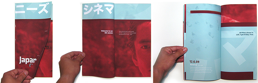
This project was challenging in that it needed to function both as a poster and as a brochure. We were also limited to using two colors, and a given set of text. It’s a poster cut down into six sections. Each section became a french fold and then side-stitched. 12 pages total. 100 lb. matte text paper.
How did you handle type? How did you choose typefaces (or pair them), and what are the faces involved?
I chose Klavika (Process Type Foundry) as the principal display face for this project, because its letterforms have subtle, yet exotic curves and a somewhat square-like appearance. I felt this structure and typographic expressiveness alluded to the Japanese alphabet. The body copy was set in Univers Regular, which I chose due to its legible and neutral qualities. This allowed the display fonts, color, and imagery to take center stage.
Thank you Erik. To see more of his work, visit erikmolano.com.


