
There’s been so much debate between the automatic kerning settings between using Metrics and Optical in Adobe InDesign. In our classes, we’ve touted a combination of using Optical plus manual kerning for headlines in most instances, but have also seen instances where using the Metrics default works nicely too.
Just a background on Adobe’s automatic kerning settings: Metrics kerning uses kern pairs, which are included with most fonts (from their designers). Kern pairs contain information about the spacing of specific pairs of letters. Optical kerning adjusts the spacing between adjacent characters based on their shapes.
A few explanations and opinions on which to use:
- Thomas Phinney on the Extensis blog explained that Optical kerning “looks at just a couple of key instances of the base spacing in the font, and then mathematically calculates spacing for every glyph pairing in the current text.”
- Matthew Butterick says to “always use the “metrics” option.”
- The League of Movable Type agrees and wrote that “choosing Metric makes sure you’re using kerning that was suggested by the designer.”
- Paper Leaf’s blog noted that the “best type designers out there test every letter pairing in their typefaces and adjust the kerning metrics to ensure the best overall experience.”
- Ellen Lupton pointed out in Thinking With Type that, “the Optical kerning applied here in InDesign has created tighter spacing for large text and looser spacing for small text.”
- Ilene Stritzver said “while you can choose Optical and Metrics kerning when creating style sheets or formatting text, your typefaces should determine which of the two to use,” in her article on CreativePro.com.
- Nikola Mileta on the Magazine Designing blog “as you can see both methods are useful, but if you are working with some cheaper fonts that were not produced at the highest level you will have to take special attention to your kerning.”
- And Jacob Cass on the JustCreative blog stated that “Optical settings can often yield better results for display type.”
The decision comes down to how well the typeface is designed. If you have a free font, you probably need to put some work into manually kerning it or using the Optical setting. Headlines need tighter kerning, so definitely use Optical or manually kern your pairs. Metrics is typically looser, so it might work well for body copy. Again, there’s no hard and fast rule here, train your eye to know good type, and then trust your eyes to make the call.
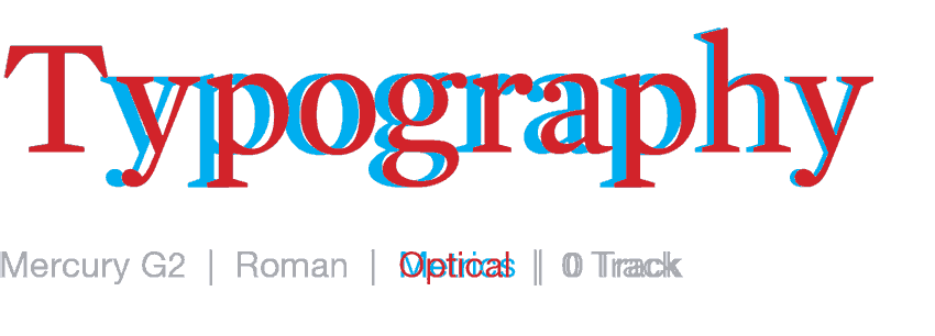
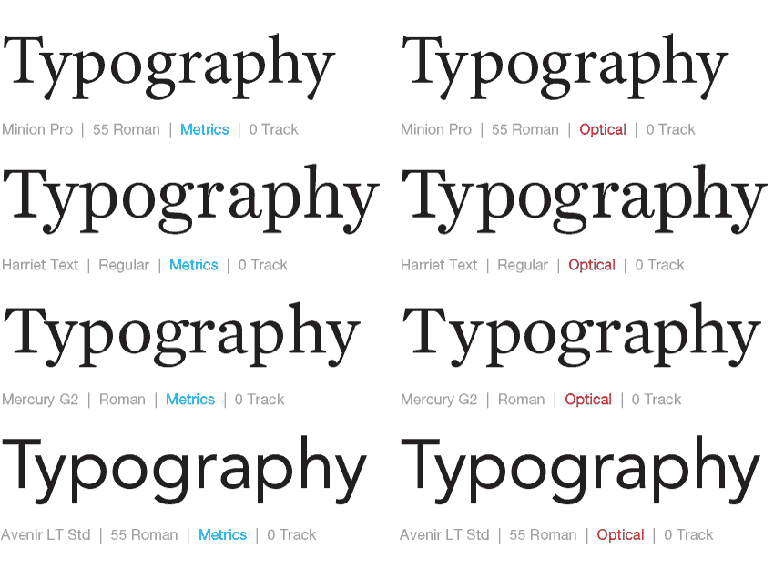
Here’s our study of a few different faces. You’ll see in some fonts the the space variations are similar, and on others they are vastly different. Which of these look better to you in these specific weights?