Our Type Therapy Clinic can be an effective treatment for chronic typographic issues and to help prevent long-term design relapse. Carmina Maust joined a clinical session with other design practioners at TypeEd.
Tell me about how you ended up here.
I wanted to be an architect but I was a bit discouraged because at the time, in Mexico it was a male-dominated carrier. Graphic Design was the best career option based on a vocational evaluation, not to mention it was a more "feminine" option so I was told by my dad. I enrolled in school for graphic design and have been in love with it ever since.
What was your typography learning experience in school?
It was very basic. I learned the difference between kerning and tracking, letterform anatomy, and the differences between serif and sans serif type. Really, just the necessary information to build a document; nothing like what I learned during the TypeEd sessions I have attended.
Who is your client? What's the project?
My client is Coco Chic LLC. The project was to design a logotype, overall brand style and printed collateral for the spa and product branding for scrub, salts and lotions in body and skin line, as well as the tea infusions in the wellness line. The logo design was to contain the words "Coco Chic," and a bird as the mark. The purpose of the mark is to use it as its own identity in product branding.
Who is the client's demographic?
Their target market is based on several traits, affluent women ages 30 to 75, married, single, as well as retired who value their skin, femininity, thus will care and invest in it. The price spectrum is very broad because of the type of services overall, between $30 and $120. The Spa is located in Watermere; a gated community in SouthLake Texas, the affluent part of the DFW Metroplex.
What did you learn in Type Therapy that you didn't know before?
That there is a relationship between the size of a logo and its byline, there is a mathematical formula between type size and leading, there is a standard to the number of words or characters in a headline, and that one has the ability to determine the size of a brochure by the number of words to be used.
What was the project diagnosis?
Michael's refined and experienced eye gave the outcome new life. The various fields and experience of the group members gave the project a rich critique.
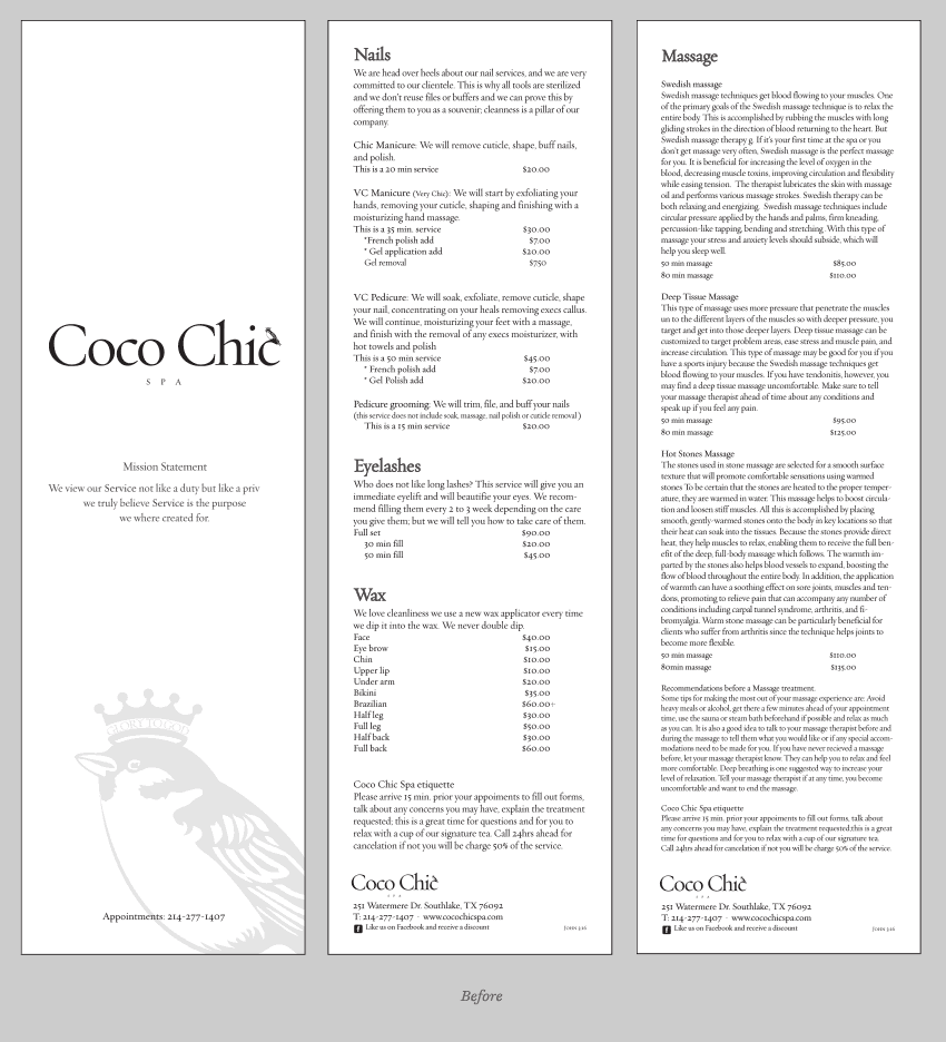
For the logo, the byline was too small in relation to the mark, the type could have used some more leading throughout and some personalization by detailing each character. The design was good but still needed more study with color treatment. For the menu, well… where to begin; to say it was a diamond in the rough is an understatement. Overall, there was no hierarchy in weight and size. The legibility was lacking as well as sophistication, it didn't have a clean and high-end look and feel.
Did your project improve after implementing the lessons learned?
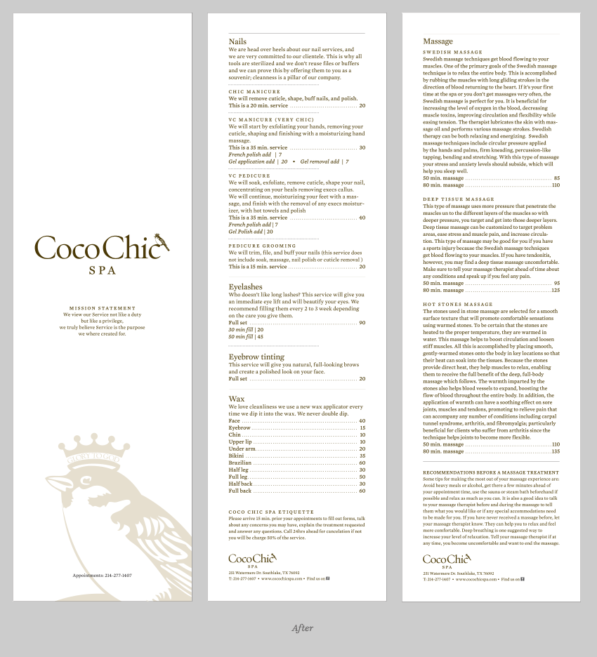
Without a doubt it improved! The logo is now whole, literally and technically-built, it's defined and solid. The menus are now visually appealing, organized, there is harmony, and sophistication — within all the categories.
What was the client's reaction?
The client is very passionate about her business, service and clients. "It's all in the details," she mentioned. She was ecstatic with the improvements. The identity now more than before, standing out, especially the sparrow, as the prominent element it was intended to be.
Did they see the design direction before your Type Therapy session?
Yes. The client was originally very involved with the development on the identity but at the same time, is open to the critique and possible improvement as the spa grows.


