

Gemma O’Brien is an Australian artist and Volcom Womens Ambassador specializing in hand-lettering, illustration and typography. She has created work for clients including QANTAS, The New York Times, Volcom, Smirnoff, Kirin and more. In her spare time, she travels and illustrates puke-puns on airsick bags for The Spew Bag Challenge. Prior to that she worked in art direction for motion graphics at Animal Logic, Fuel VFX and Toby & Pete.
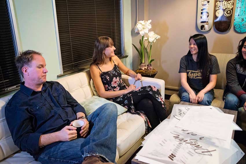
Gemma visited our studio to chat about her love of letters and generously share her process as well as a quick lesson in brush lettering for a Typography Dojo session. Rachel and Michael conducted most of the questions, we had a few questions from TypeEd alumni in the studio, and then some from our internet audience. This is a modified transcript of our time with her. Photos by Jen Parker.
Rachel: (introducing our guest) Gemma is a world-famous Australian lettering artist and she's here for a her exhibition at Laguna College of Art and Design. She does these large scale murals. She's also the Womens Ambassador for Volcom, how did that come about?
Gemma: I guess one of the creative directors for Volcom Australia had been following me for a while, and was looking for creative ambassadors she asked me to come on board.
R:Do you surf and skate and snowboard?
G: Regrettably not. I'm a bad Australian. I like surf culture.
R: How did you get started in what you do?
G: Well, I guess initially, I studied law, and immediately wasn't interested in typography. I was more interested in illustration and drawing, and graphic design in general. And then I had an opportunity to set type by hand in a letterpress studio. At that point, suddenly, the rules of typography were physical, you could touch it, it was tangible. And that was the beginning of a passion, for lettering and typography. The remaining years of university, I got to shape all of my projects had some kind of lettering or typography focus. And then over time fused it with illustration.
R: And you know, lettering is so popular right now.
G: Very popular.
R: I feel you differentiate yourself with these large scale murals. And there's also mostly black and white (referring to her mural work).

G: I guess initially, because I became interested in typography, and honestly, when you're looking at type, it's easy to see it in space in black and white, it's always my starting point. I think that set the trajectory for me in to work in black and white. And also when you're working with something, I think when you have a lot of pattern and detail, it's a lot easier to kind of carry across and be bold using only black and white. So perhaps color will appear in the future, but at the moment I like working in that kind of environment.
R: So you work small scale in sketches. Do you need to know the dimensions of the wall, do you need to know about the space first?
G: Yeah, this is the first large-scale illustrative lettering mural that I did (referring to her sketch for True To This), and I knew that it was in the corner of a room. Which is why it has this fold, as well. so I roughly worked in scale from 1 to 10 (1:10). But also I realized that The way you look at an image or type on the page, and the way you hold it, how close you hold it, is similar to a wall. So you would stand the distance away that you might hold it. I started to realize I could take that image in black and white, small scale, project the outlines and use that as the final piece.

R: How long have you been doing this?
G: Typography, lettering?
R: You're young, so that's why I'm wondering.
G: I guess… I would say, only, really in the last three years have I been truly dedicated to just lettering, typography, murals and my own work. But before that, I'd been working in motion graphics and 3D companies, so really like 10 years in the design industry, but three or four just doing my own thing. Yeah.
R: Could you show us your brush demo?
G: I guess outside the more illustrative lettering style that I do, I wanted to find something that was faster and easier to achieve something that looks interesting and had movement and vitality and could be achieved quickly as well. So I started experimenting with brush pens. I would read pointed brush lettering tutorials online and experiment with different tools.
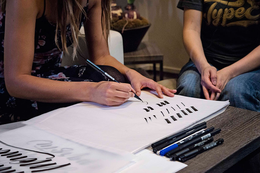

I decided my favorite brush pen is the Tombow, which is the dual tip pen. And yeah, essentially, when I started doing workshops I realized it was easy to break down the basic letters into a series of downward strokes, upward strokes. Downstrokes are pressure, then you lift, pressure, lift, pressure… usually I'll make a spelling error at some point.
R: Michael always says that designers don't know how to spell.
Michael: Ha!
G: Exactly. Basically the downstroke, you're using the full width of the brush pen, so you're holding it down on an angle and dragging, and you want to use your full arm, as opposed to just your wrist. and then when you reach the bottom, to the upward stroke, you only use the very fine tip of the brush marker.
And once you get into that rhythm, it's all about the contrast. You adjust the thicks and the thins, and you get a consistent rhythm across the letterforms. If you really break it down, you practice just doing these down strokes; full pressure. And upwards strokes; controlled flick. Same angle, so you want to join them together and that's why you get an M, for example, or an N. These are the very basic strokes, that make up those letterforms.

Then you start to move into the curves you might have an A or a C or a G. If you combine the same angle, but you drag on, much like a train track, you point along that curve, and what naturally happens, because of the angle you're holding the nib, you get this taper out at the beginning and the end. Curve, upward stroke, downstroke, you've got A. Curve, upward stroke, downstroke, you got a G!
The only time you really deviate from this angle is if you have a lowercase K. Where everything's by these angles, but then you turn your hand completely around to do the kick. And also occurs in an uppercase R as well.
M: What about a two-story G?
G: Oh yeah, you want to see a two-story g? Are you talking about like this kind? (Gemma draws a two-story lowercase G.)
M: Yup.
G: I call it a double-decker G. Either way, I think it's always interesting, depending it the context of the word. you know it's a G.

R: Any questions from our studio audience?
The questions from the studio participants have been shortened.
Ana: You incorporate really powerful illustrations within the typography. How is it that you look at a word, and begin to build that contrast?
G: I guess depending on if it's for a personal project, or there's a brief for even a word, often if there is text or a phrase, to me that's helpful. Because it's a start to contextualize the problem.
And then from that point, try to ask them what the audiences, and what type of feel it's spoken and kind of end up. For example, (in a previous project) there was already these references to things like the ocean, and I also wanted the typography and lettering to feel like it was bold, and it had a presence, and in a space, could have captured some of that potential. And so, how could you have typography but also illustration and pattern and detailing and still the idea have presence in the work.
That's sort of like the starting point for that idea.
And then from there, I will always look at the initial layout, so with that, and the illustration elements; just look at the type so I might even go on to the computer, work with existing fonts to see the layout, see what letters exists or if it's going to be stacked, or if it's gonna be a long single layout. So a lot of that preparatory work, I'll do digitally.
Then once I've got that laid out, I'll move into working by hand, kinda of, maybe moving lines through shapes, to see if it's going to be, placed in a circle or have movement this way… and then maybe build in literal drawn elements or just motion or water, or other things… step by step to resolve into final design.
Ken: I've noticed when I'm trying to do a lot of hand drawn brush script things, you work very quickly but it feels concise it feels very rhythmic. I noticed that (for me) it starts to feels that the flare at the end, it starts getting chaotic. I don't want to slow it down too much, because it loses that quality of life.
G: I think that, over time, after practicing, one thing is that the muscle memory, automatically, you just trust it. So you trust that you draw really fast, and you'll get that smooth curve. Because, if not, and you get all confident and then you try to do this big curve, and it'll be wobbly.
If you initially start with the down and upward stroke, that's the basic angle and rhythm you want to get into. Then moving into curves like in an S, or things like swooping descenders those are the places where it will come with practice over time. And like, confidence, in the movement with the stroke.

Ken: So do you practice with just words? Or an alphabet?
G: I've always practiced with words. Because I felt like, as soon as it's in the context, and you have to work that way with the letters altogether or it's going to be stacked; you're already designing. Whereas, when you work with letters in isolation, I feel like, it's not is close enough to how it will be really read. It's just a faster way and it makes it more fun as well, like a poem or a song lyric. Then, the only time I practice with an individual letter is, say i draw this once and I wanna do a variation (pointing to the word 'Quality'). How could I do this Q or who do I do this Y. So I might then trace it and see different ways to make variations of that letter.

Nicole: I was wondering if you've met any left handed calligraphers? I'm left handed.
G: In my workshops, there's often left handed people, who have different methods. Some of them do the opposite, so instead of pulling on that downward stroke they will push. But there's a guy on Instagram who's actually from Australia who's an amazing brush letterer, called Matt, I'll give you his Instagram afterwards, but he has many tutorials and he uses a left handed brushstroke. He often uses like a smaller brush pens so he can come over the top so he doesn't have to slide over as much.
R: Any questions from the internet audience?
The questions have been shortened, and not all questions from the internet audience have been included in this transcript.
Ryan: How do you go about freehanding your large-scale murals?
G: Okay, I never freehand them, that's a myth.
The illusion of freehand is very appealing in every part of art, I think, but usually at the point where someone sees, especially on Instagram. There's been a whole series of background sketches; maybe if it's been like, you know, like for the exhibition I did for Laguna Beach, we shot a video of the painting, a lot. I drew that probably ten times in brush marker on paper, scanned it in, tweaked it in Photoshop, like replaced this R better than this R, then projected it and drew pencil outlines, then painted it. There's a stop motion animation on my phone, and that stop animation is what was saved. So it was an illusion.
Jessey: Any advice to someone about breaking into lettering and getting more lettering projects?
G: I definitely know that I find it difficult to look at the early work because especially brush styles, I remember doing a job for Canon; it was like a huge commission, it was like a really loose hand written style at that time. When I look at it now, compared to what I do now, it just didn't have the fluidity and confidence in the stroke. So it's definitely you can work on and get better. For me, when I was interested in typography in design school, it wasn't as cool those days. It wasn't as many design books, there weren't design blogs, there wasn't a million Instagram accounts.
The idea of me working completely only with only typography wasn't even a possibility, I just assumed I was going to be a designer and typography/lettering would be one part of that, so I actually started a blog, and that's where I channeled all my interest in lettering/typography. I also immersed myself in the resources that were available. And now there's even more. I used to listen to Type Radio, and I Love Typography had just kind of started, so there was a lot going on, but there's even more now. so I think, for someone starting out, just get yourself out there, there's so many tools, and so many workshops, it's so easy to get started.
Andrea: What projects get you excited on a good day?
G: For me, I get bored with a particular process. So, at the moment, I've done a year of murals, so I'm on the edge. I still love the scale of the mural, but what ways can i can still work on design, and maybe work with people painting or sign painters or vinyl, or other applications to work on the scale. So, I think it's whatever's the last thing I do, once something, how can I push it further… whether it's, I feel like the responsibility of pushing legibility forever, so much the commercial work I do. It has to be readable. You know, it's not art… it isn't art.
But being able to blur the lines between art and illustration and typography is something I will continue to kind of push it. But on a good day, I will feel like I've created something completely for me, it's personally fulfilling. I know that I've done something I haven't done before, learned a new skill or a maybe practiced a new technique. You know, I've started using balsa wood as an alternative to markers and over time that became something that was part of my progress and now I teach in workshops. So, always looking for new ways and experimental techniques and on a bad day… doing the same stuff. Or this is like, "what's the point?"
Robin: How do you have creative control over your projects and navigate clients?
G: I think that one of the important things about having side projects is so you can have examples in your portfolio of work that you love and that is a style that is unique to you, so your clients can see that and say, "we really like this we want this." Whereas if you only are doing really follow certain briefs and creating work that might be trendy at the time, then that's the only example of work that people will have to see to refer to.
So I think that there's certain instances of where there are jobs where I'm like, "okay, this isn't really necessarily a style that I love, but, I'm going to do this commercial job because then I know I'll have the money or the time to work on something new or creative." It's always a push and pull to weigh like, having more control and then accepting that sometimes you might be just doing something that you're involved in.

Mike: What are your biggest influences for your work?
G: I think it's a broad range. When initially when I got into brush lettering I got into Luca Barcellona's work. He's an amazing calligrapher who really influenced and shaped and incorporating that style of work. I also love patterns or if I'm walking on the street and I see rocks or marble or anything like that I'll photograph it. And then there's so many illustrators and designers whose work I love. I really love I Love Dust, their studio, and they were like one of the really early studios that I saw that pushing and combining illustration and lettering together, so I love them.
M: They're great.
Torye: Any advice on those of us interested in getting into lettering and go-to tools?
G: There's so many online tutorials, the fact that Skillshare has some amazing range of tutorials. Martina Flor from Berlin, she is amazing letterer, I would highly recommend taking her classes online.
R: Oh, Martina! I love her.
G: Yeah! Just working with pencil and eraser is just the best starting point, and then moving into, as I said before, this brush pen from Tombow, and there's also a wide array, other kinds of pens. The Pentel markers, there's Parallel brush pens, I would recommend experimenting with lots of the yourself and seeing what's the best tools for you.
Jessica: Do you feel pressure to be unique and stay ahead of trends in typography and hand lettering?
G: It's definitely very competitive. There's so many resources out there especially on Instagram, there's a million styles, regurgitated, reused. I think the best way is to look at what trends are and be aware of them. When the chalk lettering trend was happening in 2013, its was everywhere. Dana Tanamachi, and her style is beautiful, she was doing these murals and then every art director around the world was, "I want chalk lettering!" So, you have to kind of watch that. I like to think if you can understand the origin of that trend, and ask "why is that popular?" because it kind of went chalk lettering, brush lettering, murals and large-scale stuff is hugely trendy as well.
If you look at what's driving that trend, and if it's something, if you can work out what that is and find another way to fill that need, then I think that's a good way to work.
Maggie: What kind of brushes do you use?
G: If I'm doing murals, I use brushes for acrylics that have really sticky consistency so you get a lot of resistance and get a lot of straight lines. I'll experiment with lots of different brushes, if I wanna try something with a different treatment, so it's whatever's on hand. I'll use Japanese brushes that I got on a trip, pointed brushes, just a real variety, I don't have a set that I use.
M: Talk about your paint that you use.
G: Oh yeah, so I use, for if my murals interiors I'll use Jo Sonia's which is an Australian brand, it's like a really black carbon pigment which finishes really velvety and matte. The matte finish, and you only need to do one stroke, I use that for interiors.
Cameron: Do you have a favorite and least favorite letter combination?
G: Least favorite would be, if there's two g's in a row, so you got like two descenders that, one you want to do something interesting and then they bang into each other so you have to try to find an alternative. And then I like, anything that's the final letters like an M or an N so it could be the starting point for a flourish which is always fun.
Russell: Do you need to get a bachelor of arts degree to break into this field?
G: I personally think that having, getting a degree in anything is good and studying and education is good. Whether or not my degree actually helped me where I turned out, I'm not entirely sure. But it did set up, a work ethic, and also a space to be experimental and creative without full restraints, for me, within a four year university, it's a space where you explore and learn about history, all the elements that when you're in the real world aren't all there on a daily basis and won't shape the way you see it in your approach to work that's important, especially in typography, that's been steeped in history.
Because letters have been around forever, and they're not ever gonna go anywhere but if you can see the history from different spaces in time and how they've come about, you'll have more ability to create something new or experiment. So I think, whether it's an arts degree, or whatever kind of education, it's definitely important; and they you can take it from there.
M: I've always seen it, as in sports. You got the talent to be in the pros? Then do that. Want the back up plan? Get the degree.
R: Thank you Gemma, we really appreciate you hanging out here for our Typography Dojo. What else is in store for you?
G: I'm about go to back to Australia after two weeks here in LA, and it's back in the studio, which is great. It's great doing workshops but it's always nice to be doing work in the studio.
Thank you Gemma. For more of her work, check out her Instagram feed at @mrseaves101 or on Twitter at @mrseaves. Gemma uses Mrs Eaves, the name of the font she used as her moniker when she started her blog.


