The ULV Office of Strategic Communications
The Office of Strategic Communications’ in-house design team is responsible for the visual tone and voice of the University of La Verne.
Director of creative services Maureen Panos, and graphic designers Kandace Selnick and Rachel Simanjuntak make up an in-house collaborative and communal team of three. They are responsible for the institutional branding and identity, VOICE Magazine, materials to support recruitment, and promoting the university’s four colleges.
“Before our experience with TypeEd, the creative ideas were there but the application was lacking subtle refinements to really take our work to the next level. We were beyond thrilled to find out that there were workshops that were straight to the point. All of us had completed art school but never got into the nitty gritty details of type or had forgotten type layout lessons.”
“We embarked on Voice Magazine with no magazine experience. We buckled down and quickly did some intensive learning with TypeEd. If you haven’t had the opportunity to be mentored by a seasoned art director or work at a big name studio, it’s hard to develop the skills on your own. TypeEd really filled that void and even after taking classes Michael and Rachel have been extremely helpful when we've reached out for follow-up questions and guidance.
“People from other universities have heard of us specifically because of our creative team recognition. This builds more trust and credibility working with other departments across the university.””
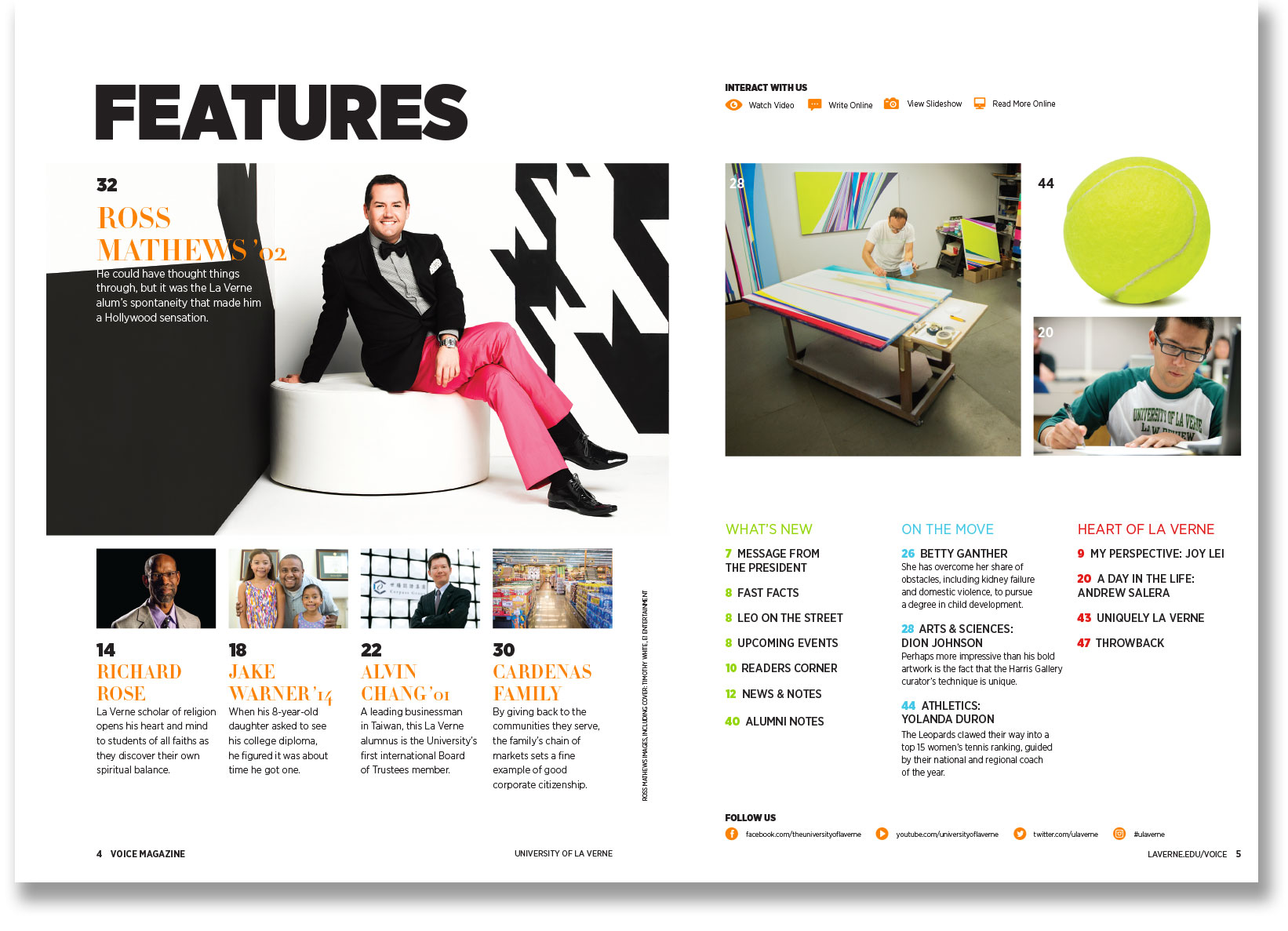
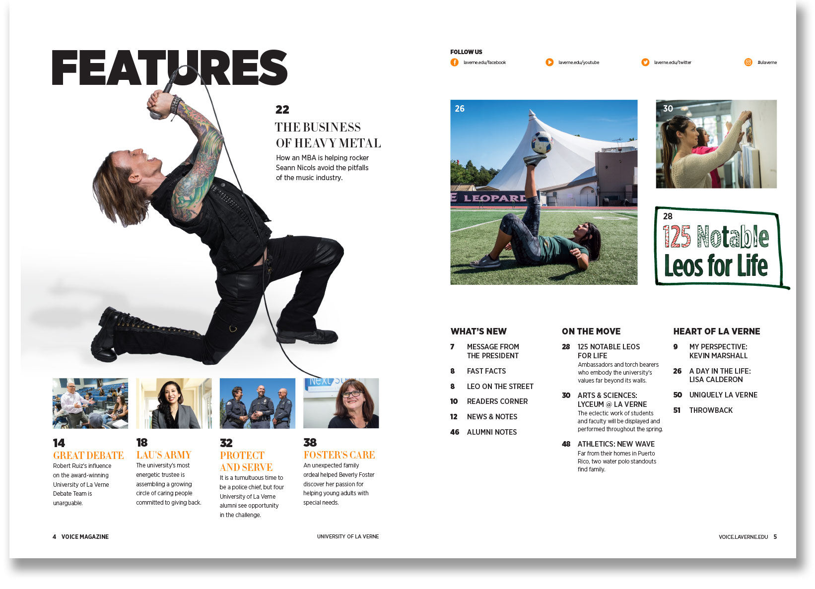
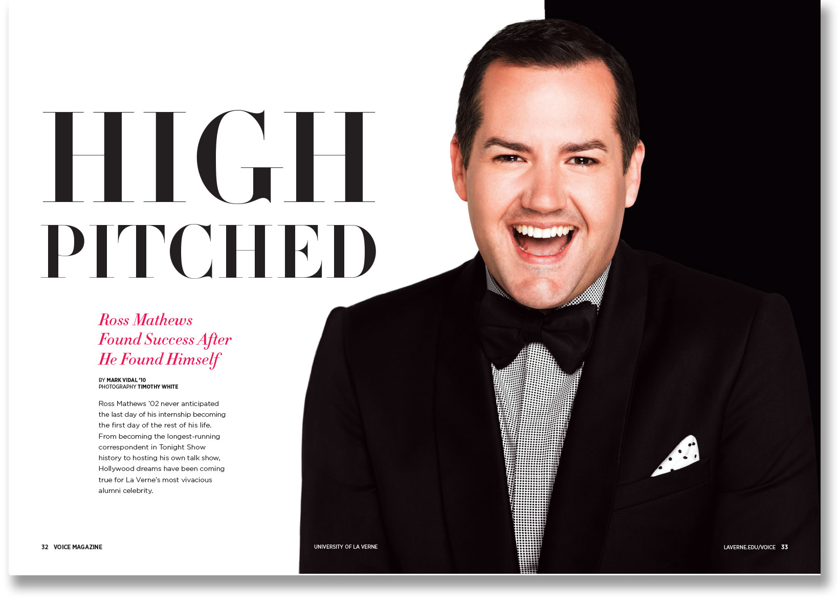
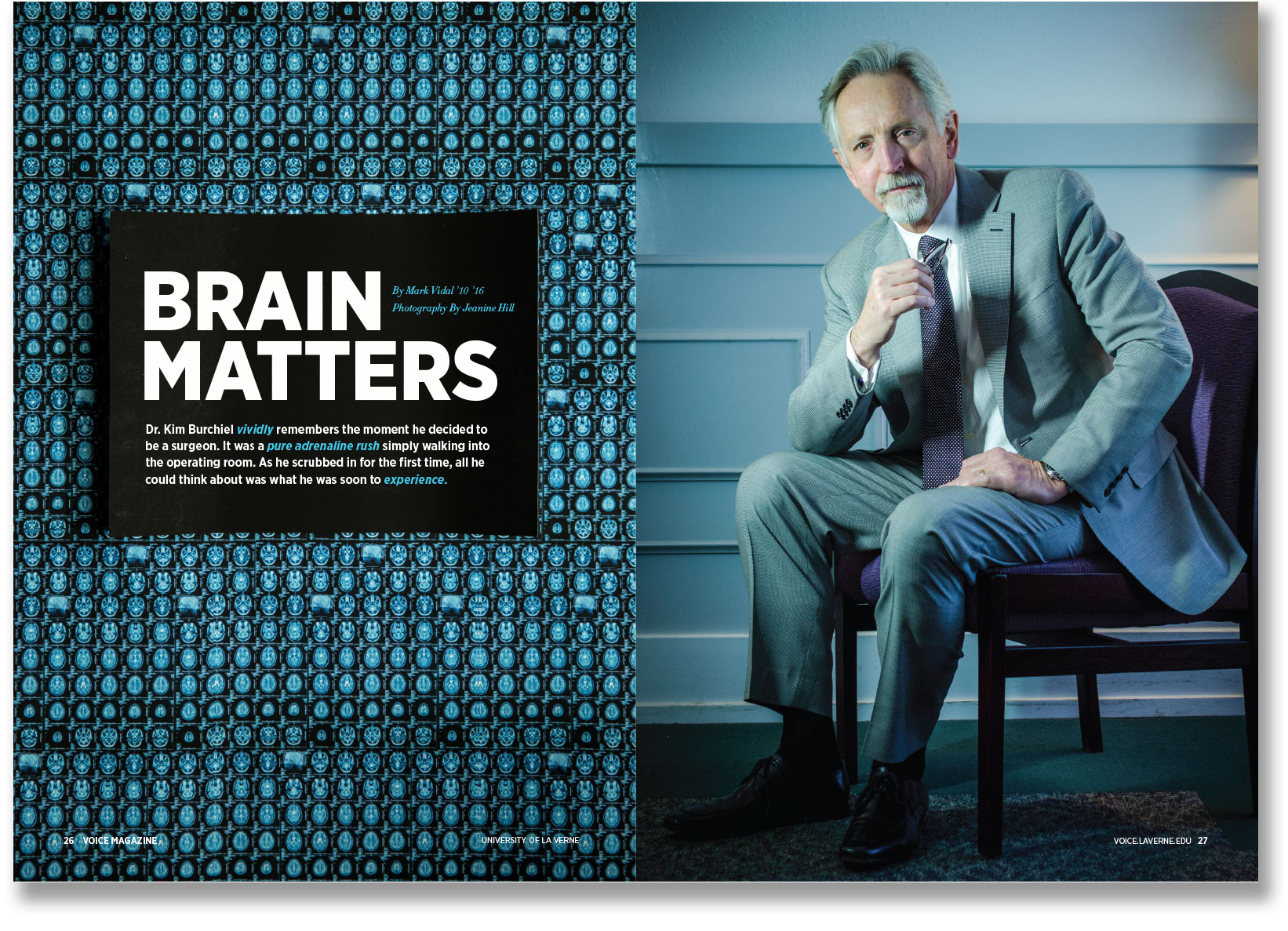
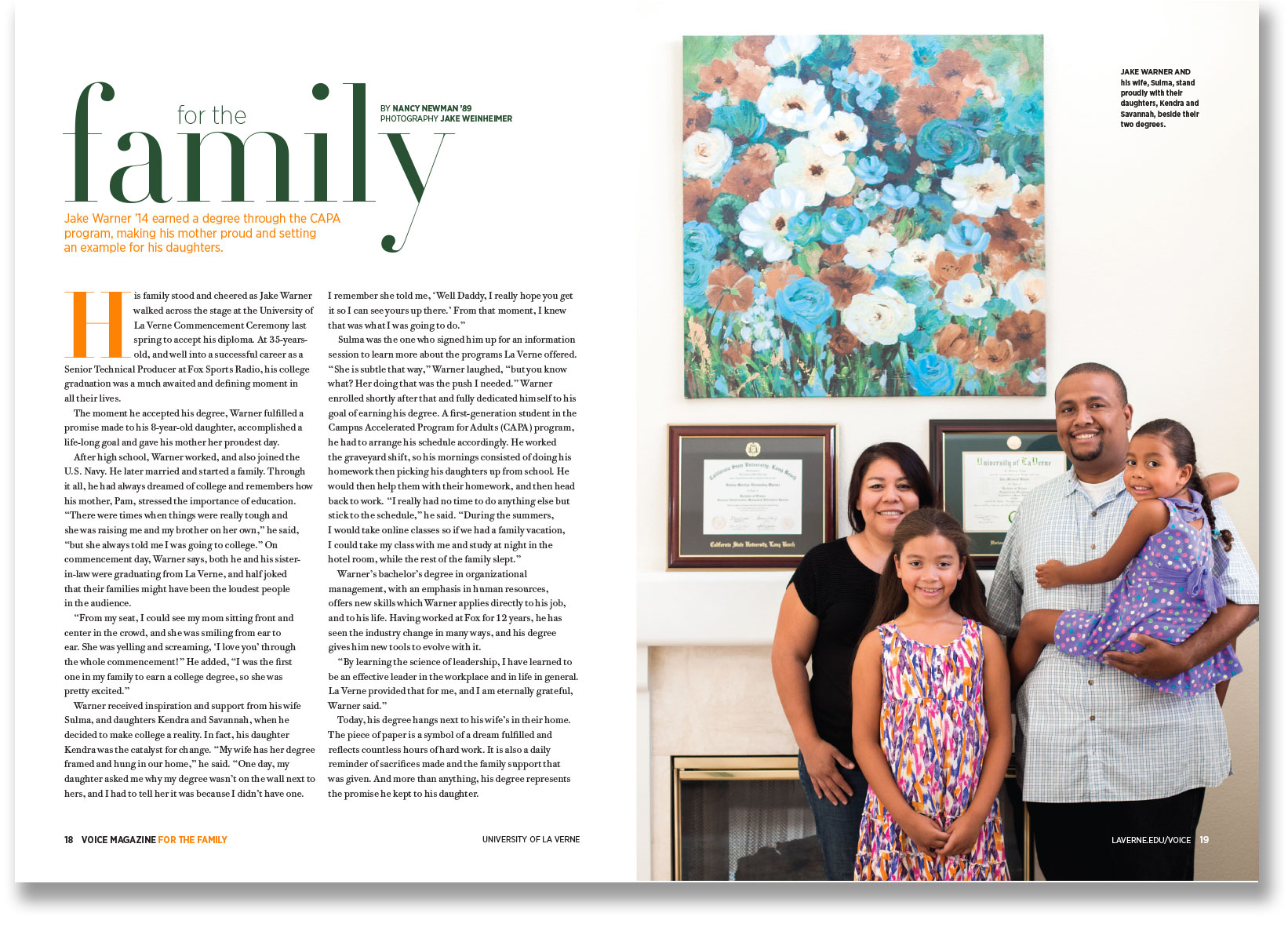
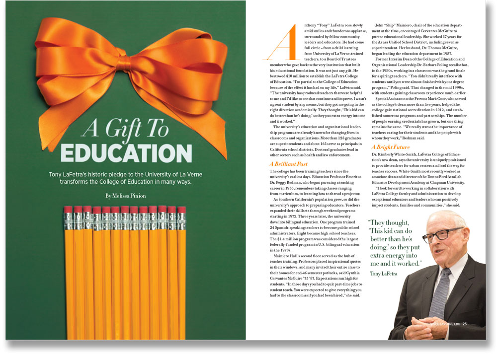
VOICE spreads: before and after.
“Problems we encountered include dealing with editorial spreads which include elements like drop caps, lead-ins, hyphenations, hanging quotes, space afters etc. Also, using grid and hierarchy to layout copy-heavy print pieces.
“Since TypeEd, we are much more efficient with our process. Our work is more fine-tuned and we have become an award-winning team for our magazine and other university pieces.
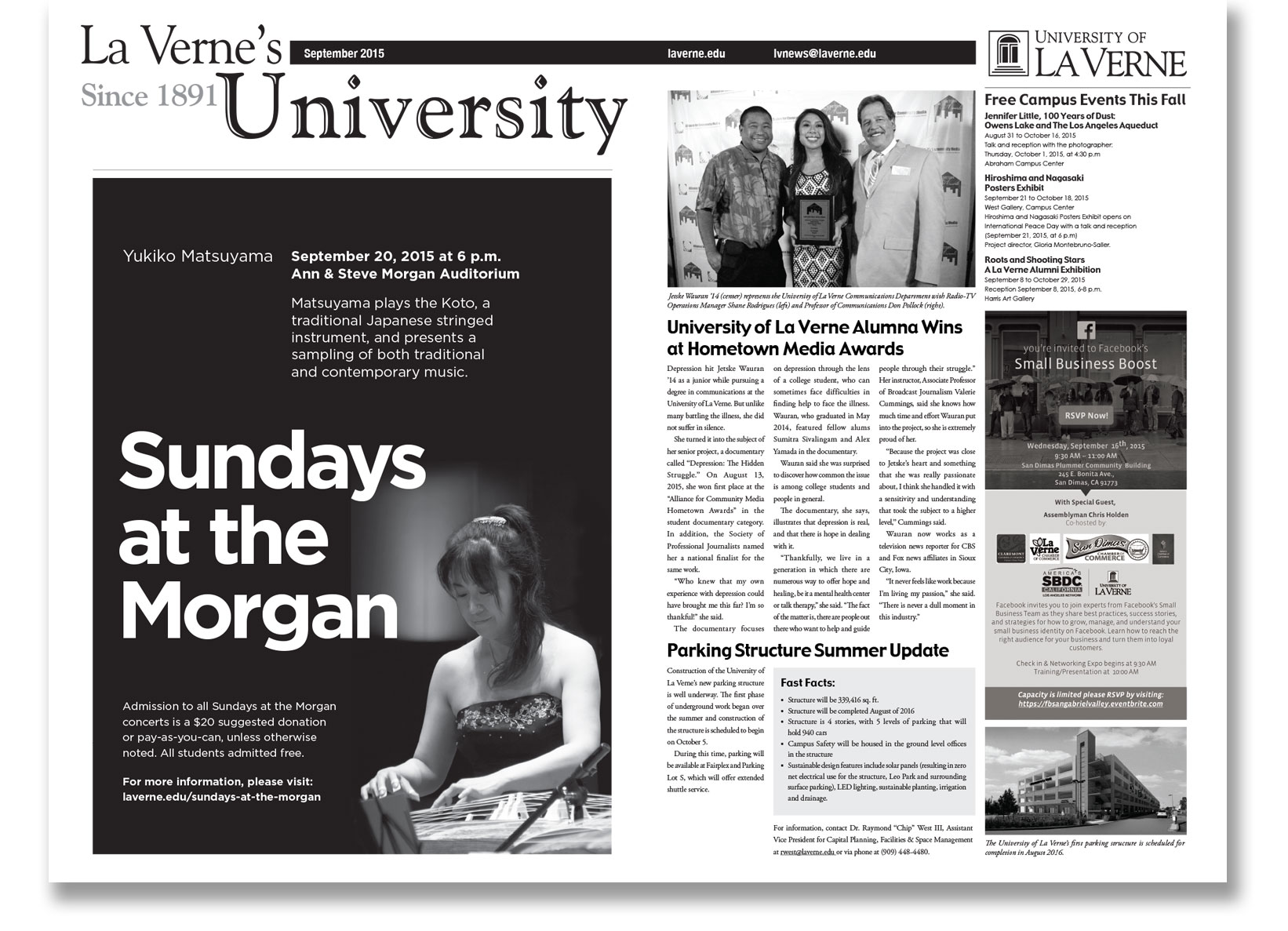
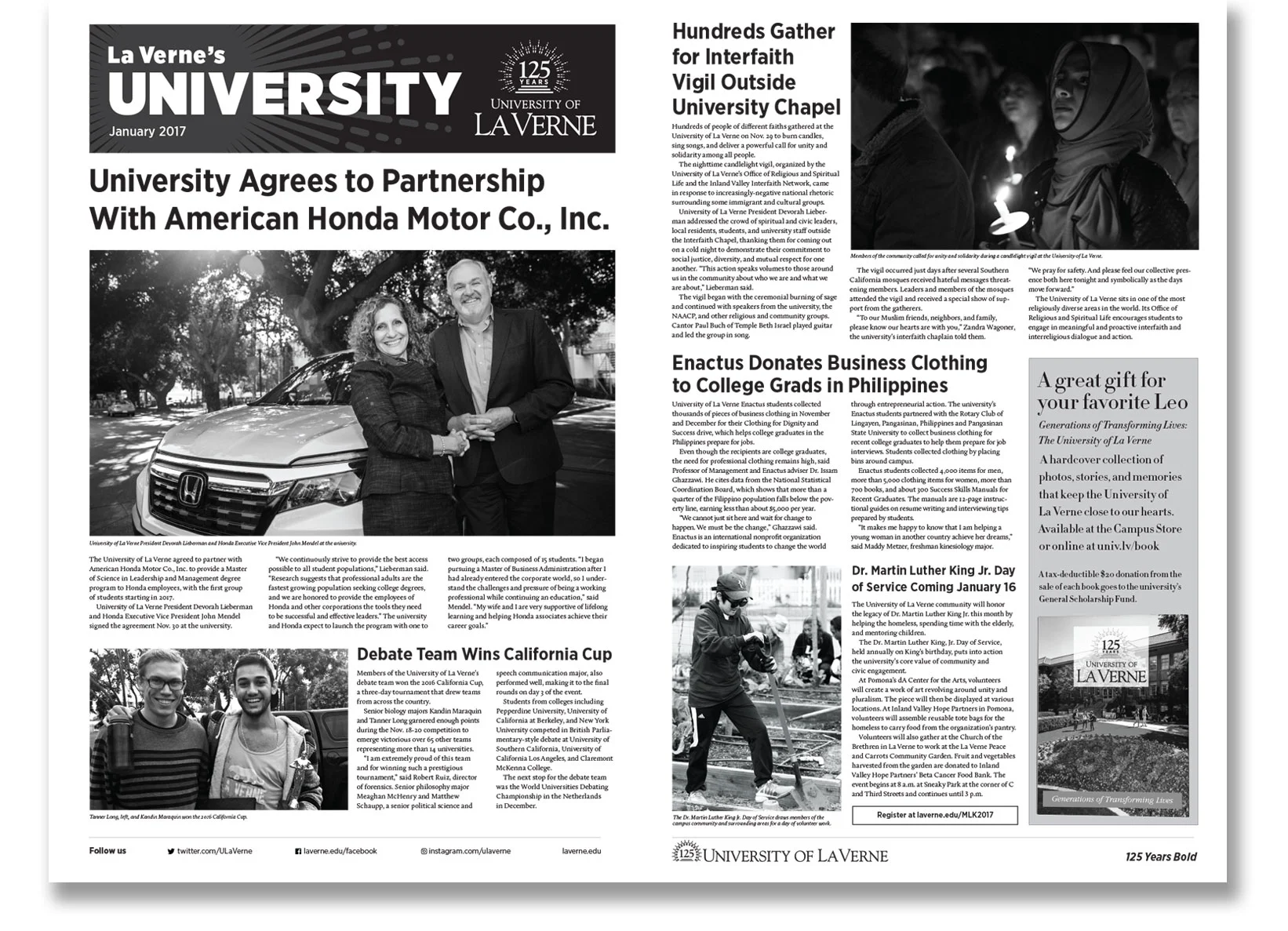
University of La Verne Newsletter spreads: before and after.
“Rachel Simanjuntak came to the team with just standard knowledge of InDesign. One of the first projects she was assigned was a large monthly newsletter. The newsletter was intimidating first, but once she had taken TypeEd classes, it boosted her confidence and the newsletter became a great exercise for working on her type skills. She was really happy to learn that there is an infrastructure to type. Once she understood the mathematics and how to create better hierarchy and pair fonts, she felt freer in my design process and wasn't weighed down by the stress of making type.
“Throughout this process our team has become even more connected and we all feel passionate about creating work that pushes us to the next level. The awards that we have won through organizations such as CASE, UCDA, and SPD have helped to elevate the reputation of our university. People from other universities have heard of us specifically because of our creative team recognition. This builds more trust and credibility working with other departments across the university.”
According to Maureen, now the team:
- Creates purposeful type hierarchy
- Diagnoses type problems quickly
- Builds more structured grids
- Designs faster and create more efficient layouts
- Recognizes the underlying structure of good design and typography
- Possesses a higher level of confidence
- Obtains increased credibility
- Quickly fixes a rag
- Speaks using correct type terminology

