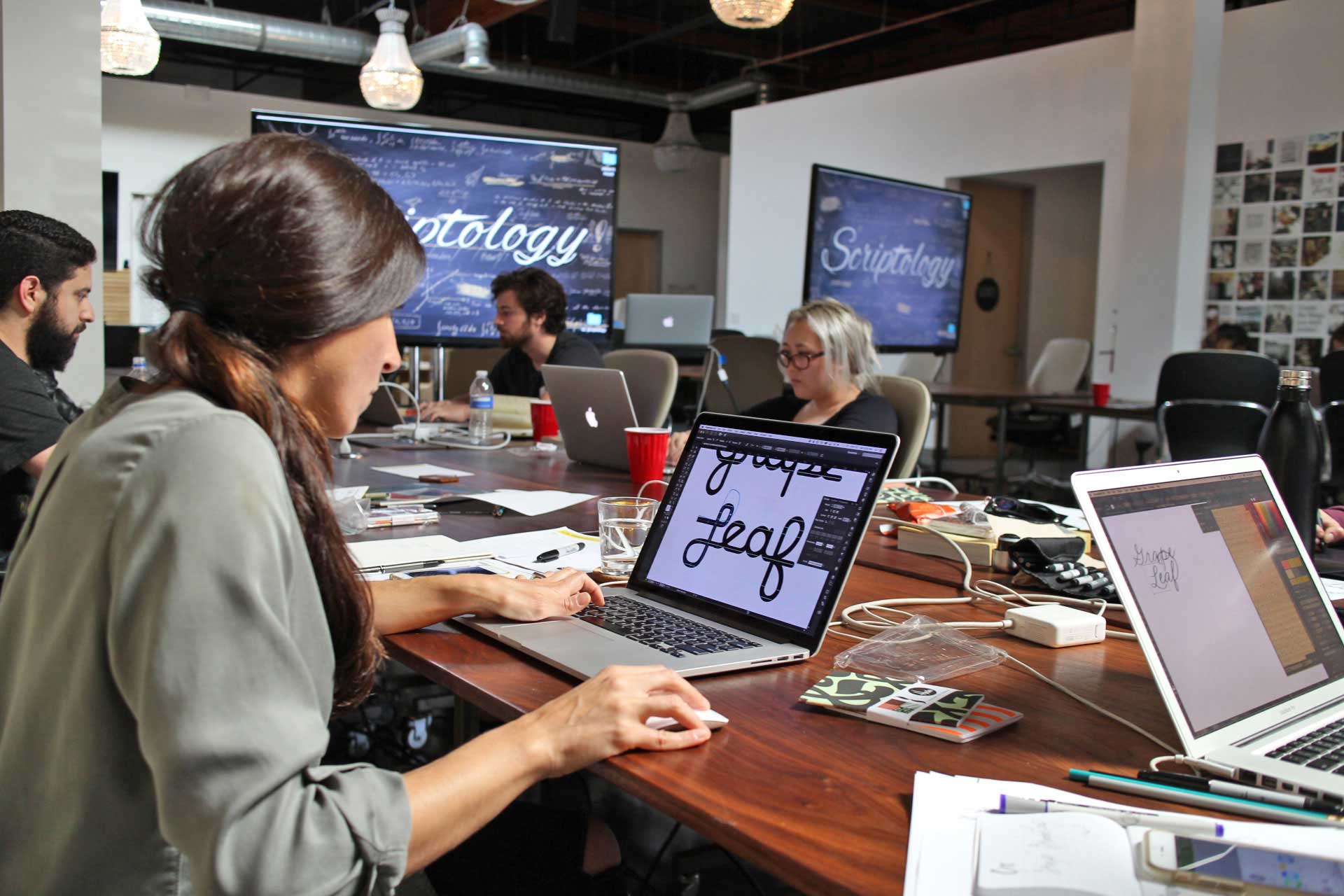
As a creative director, much of my job is about finding the right design tools to work for brands. That includes typefaces. Typefaces need to match personalities with the brand, accommodate the possible range of content and range of characters that the company will need to use in their communications, and be fresh enough to attract their audiences. Use these as accents to your type pairings. I'll bring you my fresh finds every month.
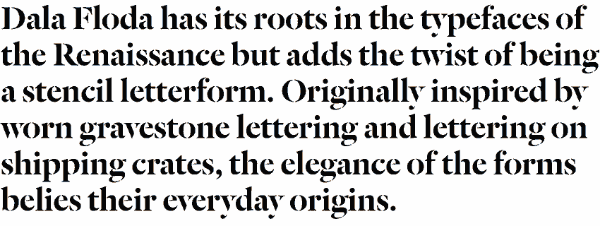
Dala Floda Collection by Commercial Type
It's a collection of gorgeous serify stencily letterforms. Tapered strokes. Elegance with wear, indulgence with history. Perfect for compelling headers.
I think of it as the modern Didot. A family large enough for editorial, like Wired. Alluring numerals. Contrast that makes you weak in the knees.

Very classic, but with a lot of personality. Lively various serifs and finials throughout the family of 32 styles. Great way to build multiple pairings within one typeface.
Enchanting and swishy, it has the feeling of a controlled brush. A bit difficult to use and is low on the readability scale, but can be used beautifully to add hierarchy.

Unda Series 3 by Identikal/T-26
Scoreboardalicious. Delightfully bitmapped dots, triangles and lines make up this futuristic face. We used this for a football-themed annual report this year.