Matthew Butterick is a writer, typographer, and lawyer in Los Angeles. He is the author of Typography for Lawyers and Butterick's Practical Typography. His most recent type designs are Equity and Concourse. Matthew gave us some insight into his typography mission and his newest efforts.
First of all, thank you. I love that you've brought typographic awareness to an industry other than graphic design. Have you seen any adoption in legal documentation/communication since you first launched your web site in 2008?
Certainly I've been surprised at each stage that there's been so much enthusiasm for the material. Originally I thought the Typography for Lawyers website would appeal to me and a handful of other nerdy lawyers. But it took off. Soon I was hearing from lawyers worldwide about how the material was helping them. Then I was asked to turn the website into a book, which has done well. Then I released the Equity font family, which lawyers really like.
I'm not actively practicing law now. But my father-in-law is a lawyer in San Francisco, and he frequently encounters lawyers who have the book. So that's really the best kind of recognition—the kind that wins you points with your in-laws.
But the legal world is really enormous. According to the Bureau of Labor Statistics, we have about 580,000 lawyers working in America and about 190,000 graphic designers. So it's a long-term campaign.

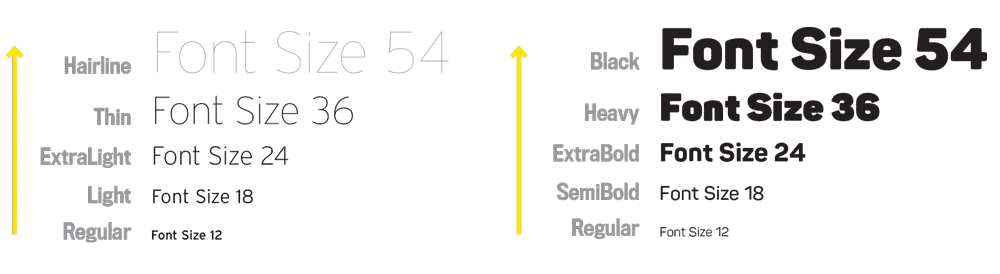
Matthew Butterick Typography Books
Typography for Lawyers is a great guide for lawyers. For whom is your new book Butterick's Practical Typography written for and how is it different from other typography books?
One of my messages to lawyers is that because their work depends on writing, they are professional writers. But this is also true for anyone who has to present their ideas in writing: academics, programmers, scientists, and many others. So with Butterick's Practical Typography, I started with the material in Typography for Lawyers and adapted it for professional writers in general. (As you might imagine, plenty of professional designers have discovered it too.)
As the title implies, what I'm trying to do is provide a more concise and actionable summary of typography than you'd find in other places. My hope is that a reader can pick up a few useful tips today, then come back next month and learn a few more, and so on. I've seen "basic" typography tutorials on the web that offer advice like "learn to use a grid." I mean, what are you supposed to do with that? Typography is a fun topic to write about because readers are genuinely curious. But it's also easy to end up in the ditch of esoteric or abstract advice, which depletes that curiosity quickly. Boredom won't bring new recruits into the typography army.
Agreed. My favorite part is Typography in ten minutes. It's a nice set of quick introductory tips to improve typography on a document overall. What inspired you to include it?
After the Typography for Lawyers book came out, I was often asked to give talks to lawyers about typography. At first I tried to structure these lectures in a similar way to the book. But that was boring. So I simplified it to the most important typography tips—those five points about body text—and organized each talk around those. That worked a lot better. Especially when you promise people at the beginning that you have five simple tips—they don't quite believe you'll pull it off, thus it builds suspense. So when I was finishing Butterick's Practical Typography, I realized I could adapt that for the web. Needless to say, it's the most popular starting page on the site. But people do keep reading.
Your reading recommendation after Typography for Lawyers would be Jan Middlendorp's Shaping Text. What online resources would you recommend?
David Sudweeks has done a great series on the FontShop blog about typography techniques, both basic and advanced. All nicely explained and illustrated. Especially if you have InDesign, since that's what he uses for the tutorials.
You've spoken about a huge disparity in design excellence between publication and digital design. Do you have any advice for designers who want to push the boundaries of interaction design?
A lot of "interaction" on the web is a device to generate pageviews and hence advertising revenue. I don't say that in a curmudgeonly way. It's just a fact. But it's contributed to a culture of interaction design that favors a frenetic, cluttered approach, no matter the context. So the questions I ask myself the most these days are "How can I simplify this even more? What else can I remove?" Because reader attention is precious—too precious to spend it on clutter and nonsense.

Beyond that, as technology improves, we have to be willing to explore the new design possibilities, otherwise we'll just get stuck rehashing obsolete habits. For instance, hyperlinks on the web were originally underlined because there weren't many formatting options in the web browsers of 20 years ago. (And the only reason we had underlining is because it was imported from typewriters.) But now that we have CSS & webfonts, we can—and should—do better.
Are there any interaction designers out there that are successfully exploring new design possibilities?
When I spoke at TYPO Berlin last year, I closed by encouraging designers to "create better things," in the sense of becoming entrepreneurial creators, and not being guided strictly by clients. So to me, that's the most interesting way of exploring new design possibilities—it includes designers like Fredrik Berlaen, Erik van Blokland, Frank Chimero, Oliver Reichenstein, Tina Roth Eisenberg. I learned later that there's even an investment group called the Designer Fund that invests in designer-entrepreneurs.
With the popularity of quick communication methods such as texting and Twitter—grammar, formatting and typography seem to be largely ignored by developers and users. How do you foresee the future of typography in documents?
Well, you're painting with a broad brush there. Texting and Twitter aren't the future of human communication. They're an outlet for a particular kind of behavior. When we're communicating ideas that matter to us, we're still choosing a richer writing environment.
As for typography being "largely ignored by developers and users," you're letting a key group off the hook—namely, designers. I've always found that developers (if by that term you mean technically-oriented people) and users are very receptive to typography. But typography isn't part of their background or training. So designers, the people who are supposed to know about typography, need to be the catalyst for education and advocacy.
If my favorite designers are the entrepreneurs, then my least favorites are the lazy ones — for instance, those who are relying on the long-entrenched design habits of the web. When I see a design blog that uses Verdana or Arial or Georgia, I want to ask that designer "why aren't you setting a better example?" Because if designers are ignoring typography, we can't act surprised when others ignore it too.
Thank you, Matthew.