Because my daughter is involved with colorguard this year, I offered to redesign the 42-page event program for the California State Band Championships semi-finals, which her high school, El Modena, was hosting. Granted, I'm designing this for free and it needed to be finished in a couple of weeks, so I did not spend a lot of time on it, nor was there time for design options or revisions. So I just assessed the issues in the design, and cleaned it up so it was more readable.
Approximately 40 high school marching bands around Southern California congregate for this competition. The event program, among concessions and ticket sales, served as a fundraising source for the school.
The cost of the program is set at $8, so it would sell more if it looked like it was worth more than $8, so that's what I aimed to do; create value with the design.
I began by looking at their in-progress working file, and found a few issues. Overall, the layout required a few basic design fundamentals concerning consistency: a grid, a simplified color palette, a typographic hierarchy system and persistent alignment. In terms of overall structure, the program needed a navigation structure, in terms of a footer system to help people find their way through the pages.
Before & After: Front Cover The original cover on the left was begging for a grid, a hierarchy system and a dramatic image that tells the reader what this collateral piece is all about. Remember, humans judge the book by it's cover, so it's gotta make a good impression. The finished cover is on the right. I implemented a grid, grouped all the content together and set it against the large areas in the image. El Modena also has two official colors which used them to keep them on-brand. The Band Championships organization logo is not well designed, so I reduced it to a single color and made it really small. Now the important info is easily spotted, even from afar.

Before: Opening Spread The inside front cover has credits and a half-page ad. On the right page, the Tournament Director's letter. My eyes kept going to the left ad, because of apple clip art; its organic shape and isolated use of red.


After: Opening Spread I developed a system of hierarchy with consistent type sizes and choices and now I'm implementing it across the flowing copy in credits box on the left and the letter on the right. For the ad, I chose an appropriate display face and visually hinted towards a candy store-look with the type and pink stripes.
Before: El Modena High School Band Page The photos were a little haphazardly placed with random drop shadows, and the band logo ran right into a photo. Because of the white background, the reading text seemed a bit harsh and generic looking in black.
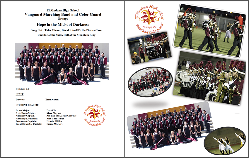
After: El Modena High School Band Page This page needed a punch of color, so I reversed out the type. Again, the content just flowed right into the grid to organize the content.
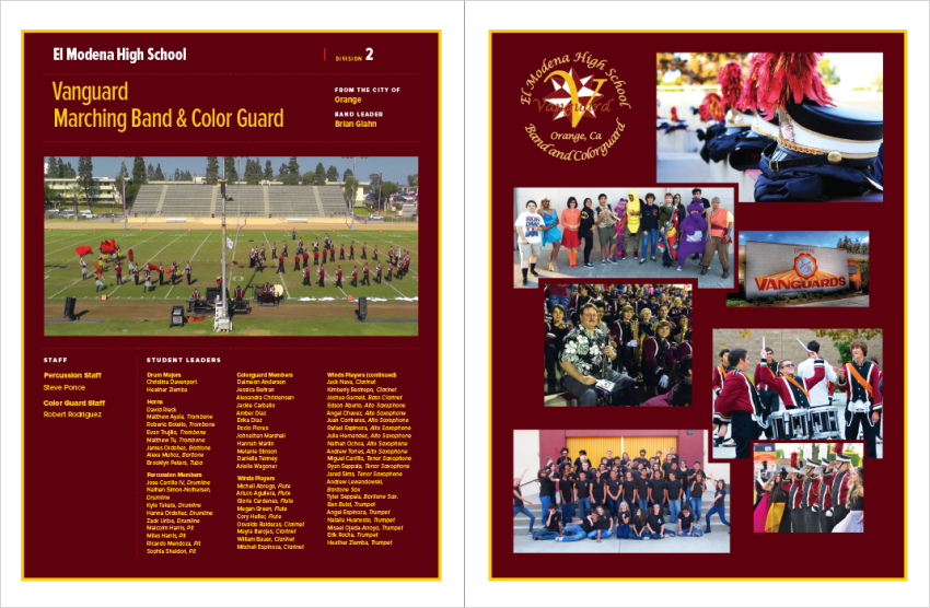
Before: Band Spreads These band page spreads outlined all the competing bands, where they were from, and other performance information. There were over 40 bands listed, and some had logos, some had photos, some bands had nicknames, others were missing information. This made information hard to find.

After: Band Spreads I used the corresponding high school colors to help fans and families find the band they were supporting, systemized the location of the information, and placed in a high school logo and band photo for each. Who was the staff? What division were they in? What city were they from? These questions were easy to answer with this new layout.

Before: Schedule & Score Card The schedule outlined what band would perform when, and the scorecard allowed spectators to keep track of scoring. There seemed to be some searching involved with this spread.

After: Schedule & Score Card How this worked, I wasn't totally sure, so I just improved upon the layout. From the schedule you could view a band, then go to the score card and easily find the band's name and place in the score. I used color to delineate between cells.

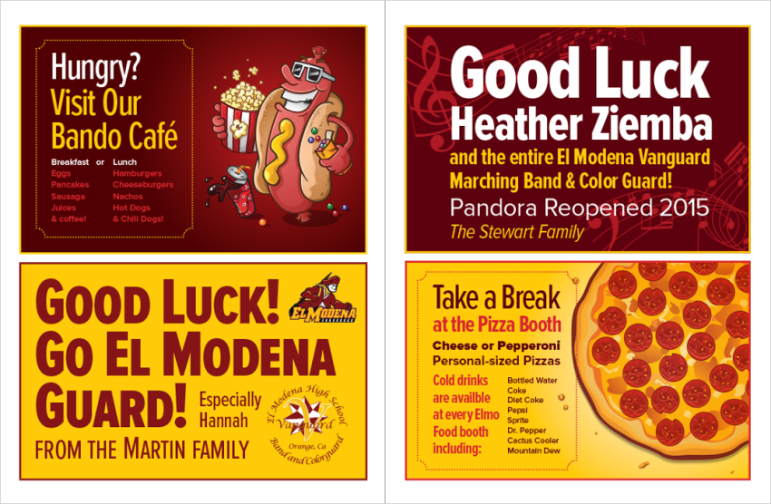
Before: Dedications & Food Booth Ads These pages allowed the performers' families to place a dedication and words of support. In the unsold ad areas, reminders to where people could purchase food were placed. Black outlines surrounded each ad, which was working, but not that interesting to look at. Most importantly, hierarchy was missing.

After: Dedications & Food Booth Ads These pages should be fun to read and demonstrate value to those who purchased dedication space. Dedications and food ads followed the type system but color and imagery helped to differentiate them all.
Check out my next Reset about overhanging punctuation.