There’s some confusion about font and typeface. I realize to some people, the terminology is super important, and to others, it’s not.
But let’s simply clarify the difference: A typeface is a family of fonts, and a font is a member of a typeface family.
For instance, “Stinson” is my family name, which in type terminology, would be a typeface. Each member of my family; Michael, Yvonne, Bruce, Diane… would be a style in that typeface, a font.
We are family. All my font brothers, sisters and me. Okay, um, well you get it.
Helvetica is a typeface, and Helvetica Thin, Helvetica Medium Oblique and Helvetica Bold are fonts. You can purchase a full typeface from a foundry, or you can just purchase a font or two from the family.
The word font is derived from the French word “fonte,” which means melting or casting. The term is attributed from the process of casting lead movable type. During the metal movable type era, not only each style or weight was considered a font, but also each size. Each point size had different proportions, adjusted for legibility.
Back then, you couldn’t just make the type larger in the character palette, you had to purchase a full drawer (or two if you needed an upper case and a lower case) of type at the next point size up. Can you imagine how expensive it would be to make your type just a little larger or smaller? Perhaps with the time and cost to create another set, clients were less demanding back then.
Nowadays it’s completely acceptable for each weight or style to be called a font, not each size, since digital type is created scalable and less size-specific designs are created for each font (a trend that started with phototype fonts).
Understanding fonts and their use is important for designers because they are part of the vast toolset they use everyday. Some typefaces are large super families that are used for creating variety and hierarchy styles. Some have small families that are more suited to long lengths of text, like books, with very little need for variety.
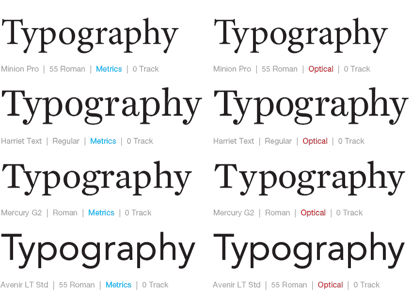
Text, display and banner styles are designed with different proportions and kerning algorithms for distinct reading distances. Knowing your typefaces and fonts can help you serve the reader.
So when your uncle asks you what font is used for the next Pixar movie title, don’t be to harsh in correcting him. But because you’re a design professional, when you use type for your work, be intentional, understand it’s purpose and always consider the reader.


