Ana Gómez Bernaus is a visual adventurer who landed in Los Angeles. Born and raised in Barcelona, Ana studied graphic design there but she was also drawn to illustration. Barcelona and its Catalan modernism style influenced her early work, creating fascination with the rich ornamentation and the details. When she decided to move to New York, she fell in love with typography. Barcelona brought her a taste for illustration, New York allured her with typography, and now both disciplines live in L.A., with lettering.

Who has inspired you?
I admire the work of a variety of artists with very different styles. Doyald Young’s work is fascinating to me. His pieces have a kind of visual harmony that feels as if they had just happened naturally. His compositions are balanced, detailed and organic and everything seems to have fallen into place. What inspires me about his creative process is the sense of craft in it and the dedication. He worked with pencil on paper and had an extreme love for details. He aimed for exquisiteness in his work and I think that is a very important notion in design in general but specially in a discipline as delicate as lettering.
Takenobu Igarashi’s work is also a reference for me. He has a modular approach to typography with a sense of dimension that transforms lettering works into volumetric puzzles. His architectural alphabets are rational, in the sense that he uses geometry and isometric perspectives in his compositions, but they also have a very emotional component that comes from the chromatism and layering of the elements. I’d say the visual rhythm that he bestows on his work is what inspires me the most.
How has Los Angeles influenced your work? Has your work changed from when you were in Barcelona?
In Barcelona, my work was more illustrative. New York added some rationality and control. So far what I am getting from Los Angeles is the taste for sequentiality. Since I moved to LA, I've learned to build my lettering pieces using 3D software, that that has allowed me to move around them as if they were sculptures. I can tell a story by focusing on different points of view. I can also build a piece and animate it’s generation: from nothingness to completion. I have now the tools to work on pieces that grow and evolve. It is very exciting and the possibilities are great.
Tell me about your process.
My process starts always with a concept. It doesn’t matter if it’s personal or commercial work, the first step is always focused on and idea and how to develop it. I write down all that I can think about that is related to that idea. I also do research to learn as much as I can about the concept I am working with.
I usually sketch a lot while I am doing this. When working with concepts visuals come hand to hand with them, and a quick sketch serves as a visual note to go back to.
When I have a clear idea of what I want to do, I usually start drawing it. For me it’s easier to get the right curves when I do it by hand, it is more natural. Once I have a tight sketch, I digitize it. Working on the computer allows me to have a greater control and to iterate faster and more easily. It is basic to me to be able to try different things and compare them. Weights variations, different relationships between letters, composition density and ornamentation.
When the basic structure of the piece is finally established, I work on textures, colors and light in order to get the feeling I am looking for.
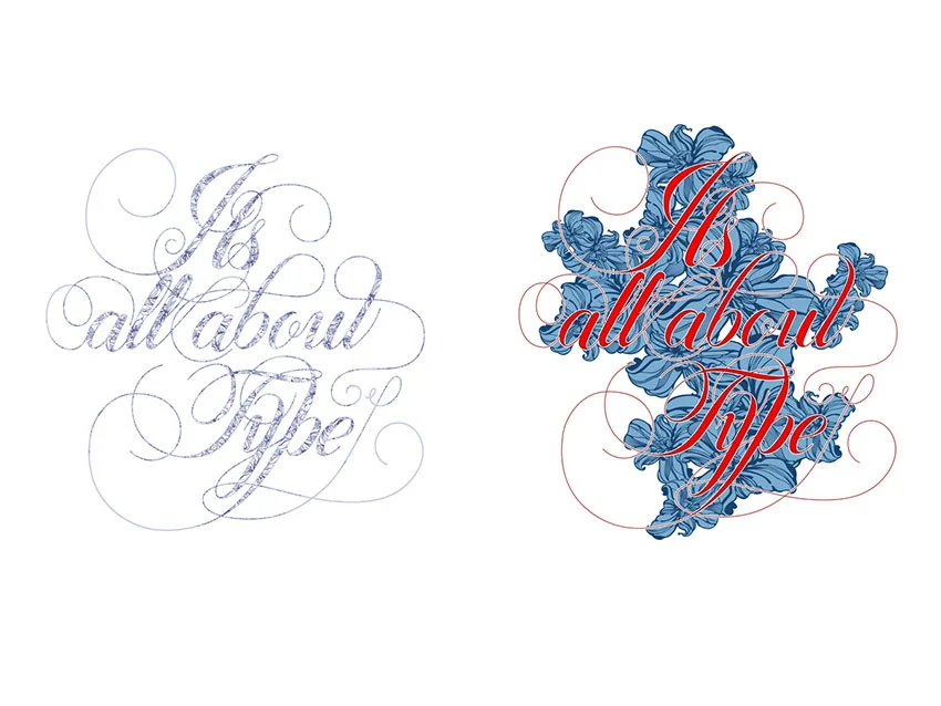
I love It's all about type. How did this project come about?
I was contacted by Andreas Leonidou, a Graphic and type designer, to collaborate in a new group he had created called Typedesigners. He had invited to the group designers from all over the world. We decided to all do a typography piece based on the same text, which was “ It’s all about type” because our passion for typography and lettering was what united us as a group.


I wanted it to be very personal, so I started sketching by hand a rather calligraphic looking lettering composition. By doing this I was able to get natural curves and shapes. Also, drawing allows me to feel closer to my work, basically because I am working on something physical that I can touch. Once I had a tight sketch and was happy with the weight and density of it, I worked on it digitally so that I could have extreme control over the details. The final piece was to be used digitally on a platform than Andreas was putting together. I believe the platform has evolved since then and now it’s called Typedose.com.

Love for Life is also just gorgeous. What was your inspiration?
The love for life is a very personal project that came from a short poem. On one hand, poetry is one of the most beautiful ways of delivering a message. It’s like music, based on rhythm. On the other, typography is language made visible, is the way in which we translate verbal sounds into graphics that carry the meaning of our ideas.

I always thought poetry would be a cool starting point in which to build a lettering piece. I started reading poems by authors like Neruda or Becquer, just to get a feel for it and get into the pace of versed language. Then one day I came across a short poem by Edna St. Vincent Millay titled First Fig. It’s only four verses, but I thought it was a very powerful text. It made me think about the intensity of life, and about the different approaches to it. The poem, as I understand it, talks about life, death and a luxurious desire for the former and fearless drive towards the latter. I thought it represented the love for life. The project came to life easily. The type of lettering to use, the look and feel I wanted it to have. It had to be splendid but decadent, and somehow dark but yet elegant to represent the life-death duality with love and acceptance for both. For this project, I worked with all the tools I have in had; pencils and paper, vector, 3D and digital effects.
Finally, I thought it would be interesting to present it as a still piece but also as a sequential one. Because the theme was so emotionally moving, I wanted it to also be, in a way, dynamic.

Thank you Ana. To see more of Ana's work, check out her web site or her Behance portfolio. She is also included in our article Georgia Tribuiani Connects The Dots.