script

A Scriptaculous Year

A Scriptaculous Year

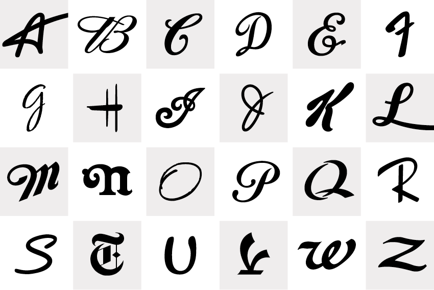
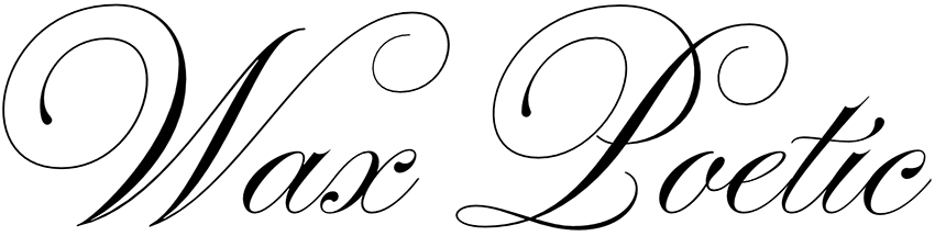
Ed Benguiat had once said, “I do not think of type as something that should be readable. It should be beautiful.” And in 2013, type choices were gorgeous. It was a scriptaculous year with the interest in script type, hand lettering and calligraphy was at an all time high. Perhaps it was a bit of penmanship nostalgia due to our increasingly digital lifestyles or the fact that cursive handwriting is starting to disappear from public classrooms. Whatever it might be, we're glad that people love it.

The Lettering Pilgrimage of Ana Gómez Bernaus

The Lettering Pilgrimage of Ana Gómez Bernaus

Ana Gomez Bernaus is a visual adventurer who landed in Los Angeles. Born and raised in Barcelona, Ana studied graphic design there but she was also drawn to illustration. Barcelona and its Catalan modernism style influenced her early work, creating fascination with the rich ornamentation and the details. When she decided to move to New York, she fell in love with typography. Barcelona brought her a taste for illustration, New York allured her with typography, and now both disciplines live in L.A., with lettering.

Leah Faust Brings Back the Renaissance

Leah Faust Brings Back the Renaissance

Bottega Louie is buzzing with energy before most other restaurants in downtown Los Angeles are even open. The 10,000 square foot Italian restaurant‐market‐patisserie commands a presence on the street, but not because it looks like a palace adorned in marble and brass. The crowd is drawn in visually through large windows due to brightly‐colored Parisian macaron towers and an array of pastel boxes embellished with logos and tied with silk ribbons designed by Leah Faust.