“The devil is in the detail” is an idiom for that which is small things are often overlooked and cause problems later on. Much like a beautiful wine glass with a hairline crack. Although tiny details seem insignificant, the imperfections disrupt an experience, because they too are essential to the whole.
As I progress in my design skills, I notice imperfections in my work, especially in my old work! And as I continually train my eye, I notice imperfections in type around me, as we call type crimes. Knowledge is a curse. Although ignorance is bliss, that doesn't mean the reader is not interrupted while reading.
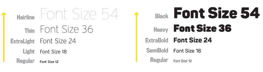
Micro typography is an advanced practice to improve readability and can demonstrate an elegant, uninterrupted, and cared-for reading experience. Micro typography encompasses small adjustments on the character-level and address typeface and weight choice, hierarchy, spacing, alignments, justification and hyphenation preferences, kerning, beautiful rags, and choices and placements of glyphs so on.
Well-designed passages of text allow readers to become engrossed in the content and the words. Attentive designers who design for the reader can use micro-typographic practices to steer clear of awkward spaces, odd weights or spaces, and other distracting speed bumps on the page.
I feel a major typographic difference while reading an issue of Worth Magazine compared to reading the Los Angeles Business Journal.
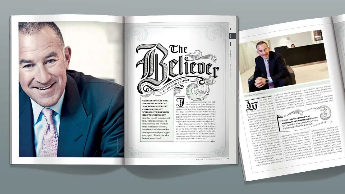
Worth Magazine image copyright Valerie Sebring
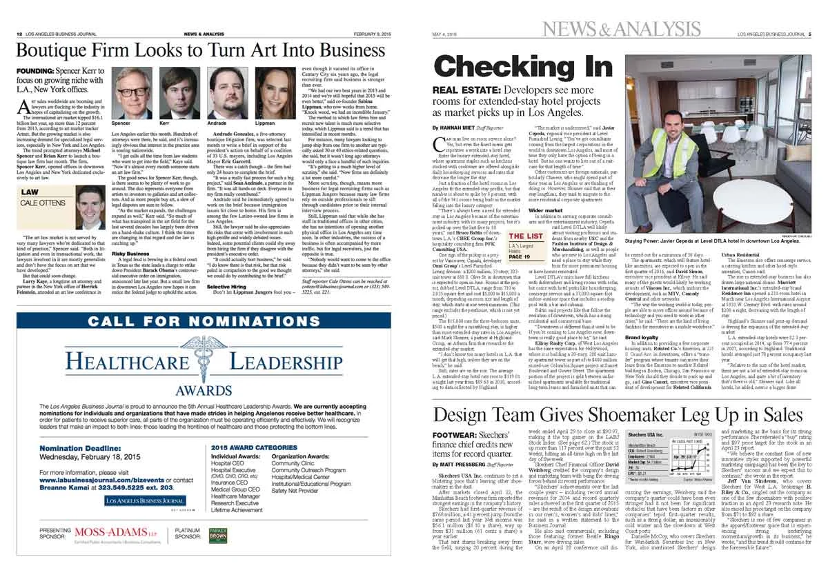
Los Angeles Business Journal image copyright LA Business Journal
The perception is that Worth costs more (or has a higher value) than Los Angeles Business Journal is from the proportional handling of the grid and typography. Choices in typeface, hierarchy, contrast and layout to build a strong a design system can make a huge difference (view our redesign proposal of the Journal).

LA Business Journal design image copyright Ramp Creative/Michael Stinson
Glyph Spacing
A detail that helps to support a continuous reading experience is spacing. Here’s some guidelines for use of spaces between glyphs and type (did I forget any? Let me know).

Glyphs that need a space after are:
- copyright symbol
Glyphs that need a space both before and after are:
- plus and minus signs within mathematical equations
- ampersands
Glyphs that sit right next to type are:
- registered marks
- trademarks
- asterisks
- positive and negative signs
- degree symbols
- at symbol
- primes and quotes
- currency signs (if placed within body copy)
Glyph Placement
Michael Stinson, my partner, speaks on the below video clip about how to place registered marks and trademarks alongside a wordmark.
Here are some examples of registered marks and trademarks with type lined up to type.


He also demonstrates some small adjustments to typeface choice, hyphenation and justification to improve the design of a magazine article and how to overhang punctuation in Adobe InDesign.
Fine-tuning your type control can make a huge difference and increase the reader’s comprehension. Good typography is about subtlety. And the discriminating reader will distinguish the difference between a good reading experience and an outstanding one.