Every once in a while, we bring our Wine & Type Pairing social event to designers, and we like to share our method of pairing typefaces to make the process easier and faster. In this mini-workshop, we reveal three ways to pair typefaces together in a quick and easy method that saves time for designers.
Two typefaces create a solid foundation for any type system, and here is our process for building a two-typeface system.
Type pairing is an art used to dramatically improve a typographic system with unity and variety. The characteristics of typefaces can compliment and harmonize with each other to create eye-catching combinations and breathe new life into any layout.
Here are the three steps we recommend:
- Consider Classifications
- Blend Characteristics
- Find Balance in the Details
Step 1: Consider Classifications
Type classifications fall into two basic categories: serif and sans serif. A serif typeface has features that resemble small ‘feet’ connected at the end of the strokes. A sans serif typefaces does not have the ‘feet.’ The French word ‘sans’ means without.
Digging deeper, we introduce students to four simple classifications within the serif category and four within the sans serif category. There are more, but four is a great place to get started.
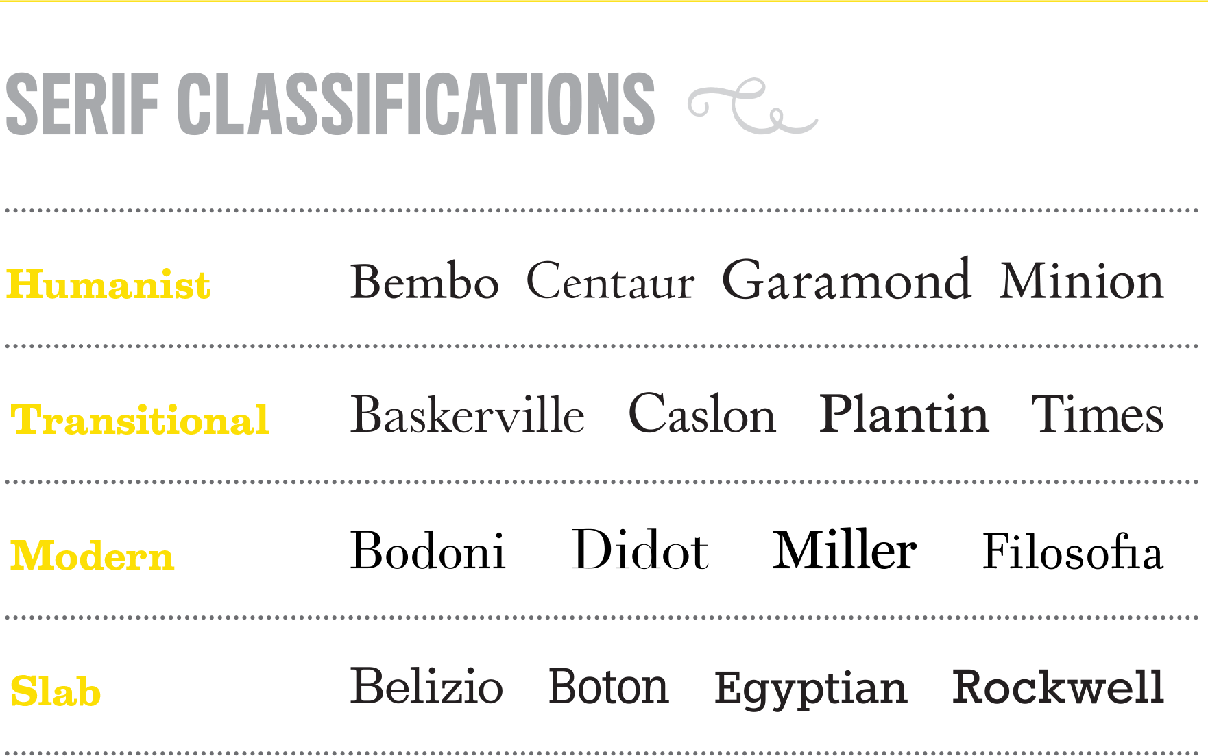
Within the serifs category, there are four basic classifications.
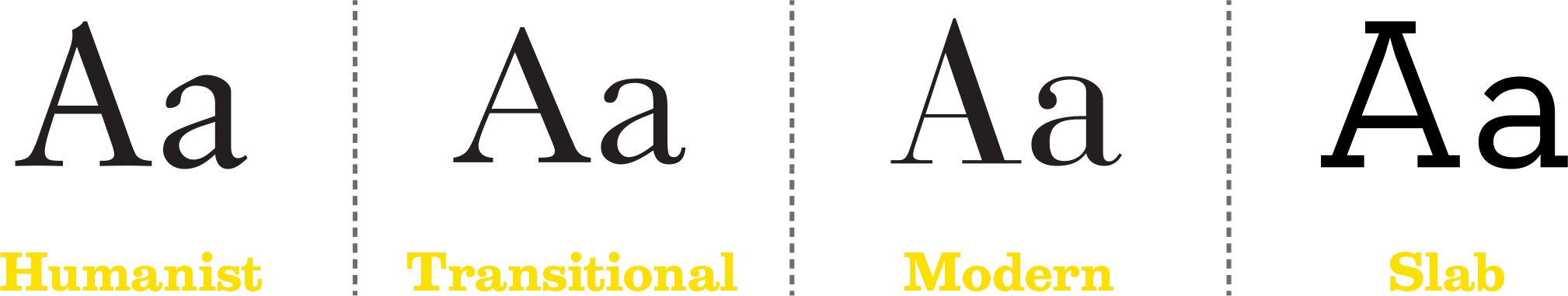
Humanist Serifs typically have low contrast throughout the strokes. If the letterform looks like it could have been drawn with a pen with a 45-degree angle, it’s likely part of the Humanist class. Some examples of these are Garamond, Minion, and Bembo.
Transitional Serifs have a taller x-height than Humanist serifs and have a bit more detail, such as ball finials, curved tails on the lowercase ‘a’ and medium contracts throughout the strokes. Some examples of these are Plantin, Baskerville, and Caslon.
Modern Serifs have delicate details and high contrast throughout the strokes, with few or no brackets. Some examples of modern serifs are Didot, Bodoni, and Miller.
Slab Serifs with no brackets have thick serifs that are typically the same weight as their main stems and strokes. Some examples of slabs are Boton, Archer, and Rockwell.
Within the sans serif category, there are four basic classifications.
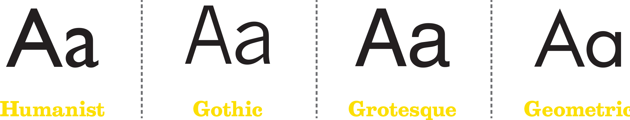
Humanist Sans Serifs, like Humanist Serifs also look as if the letterform looks like it could have been drawn with a pen with a 45 degree angle, much like the Humanist serif class, but without serifs. Some examples of these are Frutiger, Optima, and Gill Sans.
Gothic Sans Serifs are space savers. Designed with varying widths, these typefaces have minimal contrast, vertical stress and a large x-height. Some examples of these are Franklin Gothic, Whitney, and News Gothic.
Grotesque Sans Serifs were designed 19th century and the first decade or two of the 20th and typically have uniform, upright characters and irregular curves. Some examples of these are Universe, Neue Helvetica, and Franklin Gothic.
Geometric Sans Serifs are built around geometric forms. Many of the letterforms look like shapes with circular bowls and triangular apexes. Some examples of these are Avenir, Futura, and Gotham.
Keep classifications in mind when choosing typefaces to clearly express harmony and personality, and to simplify your complex choices. You’ll want to consider these type classifications to help narrow down your choices quickly and eliminate any need to endlessly scroll through the character palette.
Each class has particular letterform characteristics and knowing them will help you identify, pair, and save you a ton of time.
Step 2: Blend Characteristics
Blend characteristics such as x-height and character width for better hierarchy preference and balance in overall body.
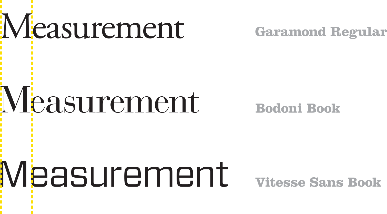
X-Heights The x-height is the distance between the baseline and top of the main body of lower case letters, excluding ascenders or descenders.

Helvetica set at 12 points is not the same size as Caslon set at 12 points. I know, hard to believe. Each design of type is inherently different. There are characteristics that make letterforms larger and smaller-looking, even at the same type size. Helvetica is larger in character width and x-height than Caslon.
Character Width The em unit is the standard measurement of the width of a font. Each font will have a different em, loosely based (but not exact) to the width of the capital M.
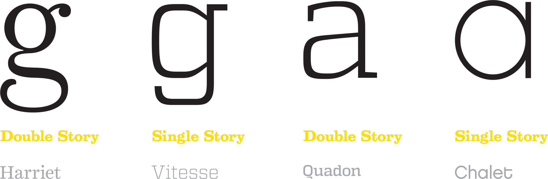
Another thing I look at for pairing is the letterform variants in the type design, called allographs. These are the differences between single story and double story characters in the lowercase ‘a’ and ‘g.’ One variant is the type we use for writing, the other is best for reading. One is not always preferable over the other (but it depends who your audience is), just be aware of the character set when pairing.
Step 3: Find Balance in the Details
Similarity in the details of both typefaces will create rhythm and balance on the page with subtle notes. Placing two fonts of the typefaces on top of each other will allow you to further analyze the details.

The styles should compliment each other’s personality with a bit of contrast, but not so much that it’s visibly clashing. Remember, you as a designer are a casting director for a movie. You are seeking typographic actors to fill the roles needed to tell your story through the design. Be sure that the overall personalities of your actors do not clash, that one takes a leading role and the other a supporting role, and that they compliment each other in their details.
In creating balance, I’ll look to see if the letterforms have similarity in the details, such as the axis of the o, the overall slope of the characters, the length and height of the ascenders and descenders, and if there’s too much contrast in the personality or age of the typeface.
In our Wine & Type session, we go deeper with strategies and tips for pairing, but I begin with classifications, making sure the characteristics of each typeface blend well, and then look at balance in those tiny details. If they create harmony, balance, and a bit of contrast, then you’re on the right path.
Want to go deeper?
A quick way to find pairs is to use a gigantic superfamily for font pairing. Here are handful of superfamilies to consider.
Cookbook projects require more awareness of the glyph set and a third or fourth typeface to consider.
A deep dive in analyzing and pairing typefaces and fonts can be found in our type pairing class on CreativeLive.