
Say you have a new client who hires you to design their company identity. When beginning design directions, where do you start? What types of logos should you present?
There are five different types of logos, or six, if you include characters/mascots. Let's review:
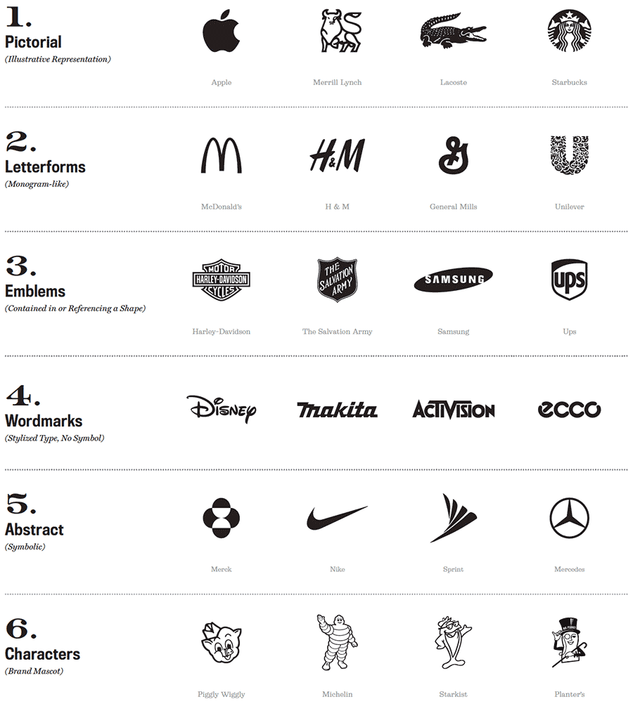
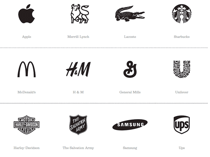
- Pictorial symbols are illustrative representations of the brand name that is emblematic of the company, brand or product. The visual is typically story-based and more illustrative than an abstract symbol that helps to increase recognition and uniqueness. New brands need to include a name with this symbol (combination logo) together to build brand recognition and equity.
- Letterform logos, which include monograms and letter marks, are perfect visual instances for acronym brand names that are long, difficult to pronounce or have many words. It is usually designed slightly more pictorial or stylized than just a simple letter to assist with recognition
- Emblems are contained in a shape, either visual or inferred. They have an official look when placed into a badge or seal shape, but if not design correctly, can be difficult to use at small sizes depending on the number of elements within the shape.
- Wordmarks (or logotypes), are typically the longest-lasting of all types of logos, incorporates the company or brand name uniquely stylized by itself or simplified as part of a combination mark. Legibility of the wordmark must be considered in addition to recognition. The only time legibility is not the primary goal is if it’s a script or signature, denoting brand with a family history or a personal touch.
- Abstract symbols take less time to process and in most instances, they express ideas more effectively than words. They are also universal nor have a language barrier, so they’re perfect for international companies. New brands need to include a name with this symbol (combination logo) together to build brand recognition and equity.
- Characters (or mascots), technically Pictorial Symbols, were first popular within sports teams, and later became popular with household brands in the 1950s and 1960s through the work of Leo Burnett. Characters create an identifiable face and add personality to the brand. They are sometimes incorporated as part of the primary logo, and other times only used as a brand asset in certain instances.
For new identity projects, try to present at least two or more of these options (depending on client size and goals) to demonstrate deep exploration of the possibilities. There is almost never one single solution.
As a general rule, for smaller companies, aim for pictorial combination marks, emblems, and wordmarks. For larger brands, aim for abstract symbol combination marks and wordmarks. If you have a list of future identity applications, use your best judgement before presenting logo types. For example, if the client needs to apply their embroidered mark to apparel or if the mark will be used on primarily golf balls, then a character symbol with tiny details may not be the best solution.
Present a set of strong and varied examples of design thinking within your logo exploration and your client will appreciate it.
If you are a practicing designer and you’d like to design and sell full identity systems for $10,000+, book a call and let’s talk about how we might help to get you there fast.