"Two words: Flex Friday," says Fleming, Art Director at USC University Communications Design Studio. "We tend to slow down a bit over the month of July, during which, our creatives are each encouraged to take a Friday break from the office to seek out inspiration."
Sheharazad Fleming originally intended to go into advertising. She moved west from Washington, DC, and became a project director for a design firm in Los Angeles and after eight years, she fell in love with the design industry. Now, as the University Art Director at USC University Communications, she works closely with partners throughout campus. We at TypeEd asked her what it's like working with a team with the constant demand of an active campus and all their departments.
Educating the Team
Fleming's in-house team handles design and creative direction for all over-arching university marketing initiatives including advertising campaigns, university events, presidential projects and university publications. The design team consists of two senior designers, one junior designer, a production coordinator/project manager and two student interns.
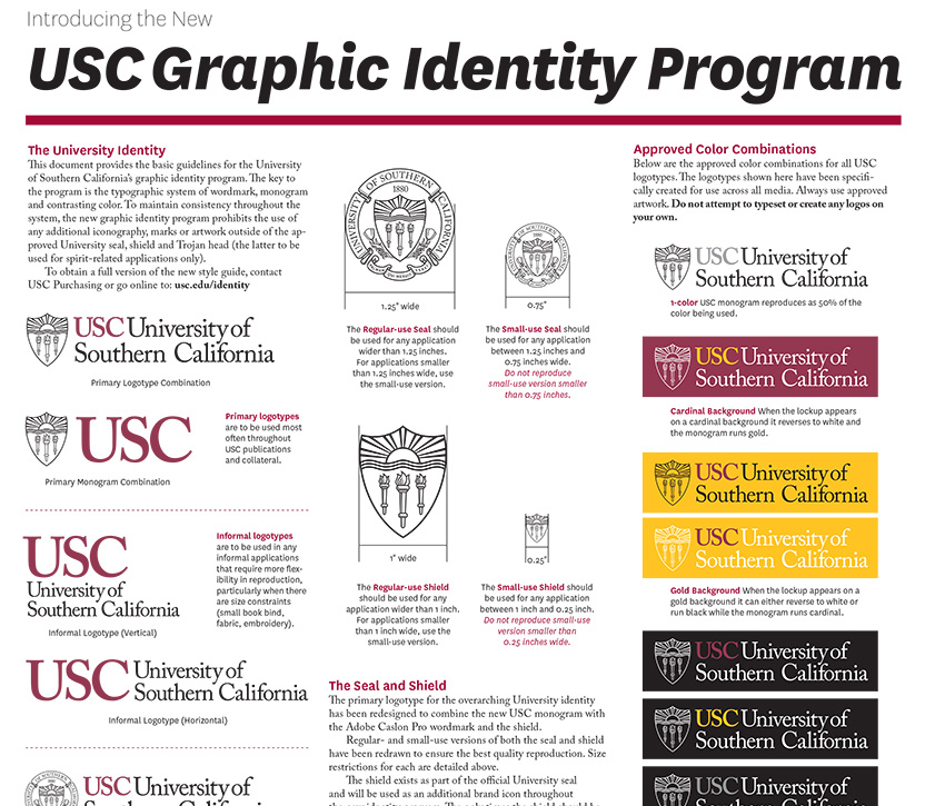
"When you're running a busy creative department, mentoring and educating is definitely one of the hardest tasks to make time for, but without a doubt, it's one of the most important," says Fleming. "It's particularly important for us to educate interns and junior staff on typography because the university's graphic identity system is almost entirely type-based. All approved university logos are typeset in Adobe Caslon Pro."
In addition to our style guide manual, the team created "cheat sheets" that give step-by-step instructions on the nuances of the two university-approved typefaces—Adobe Caslon Pro and National—their distinctions and best practices for usage. "We also encourage all design team members to read The Anatomy of Type by Stephen Coles, which covers the basic fundamentals of typography, but more importantly, gives an in-depth analysis of the intricacies of 100 classic typefaces, Fleming mentions. "They're arranged by type classification, so not only can you learn about the 'anatomy' of any given glyph within a character set, but you've got a brief history—release dates and designer/foundry information—available at a glance. It's like an almanac for type and it's a key part of our in-house reference library."
Keeping Creative Staff Inspired
"We leave the term 'inspiration' undefined, so it could be anything from catching a foreign flick to visiting a historic neighborhood or checking out a museum," says Fleming. The only requirement is to come back and share what was learned, saw or explored at the next team meeting. "I encourage my team to stay curious."
"We also have a Lynda.com account and we've found that learning new skills, tricks or tools is a good source for inspiration. The best way to be the most popular person on our team is to learn a new trick or shortcut in Creative Suite and email your finding to the team. Instant hero!"
Working Within the Brand Guideline
"Strict. Strict. Strict." As USC is the largest private employer in Los Angeles, a unified and consistent visual identity is a critical component in the university's positioning. Saul Bass designed the university's identity in the early 90s. "By the 2000s the identity had degraded and it was time for a review. Partnering with Pentagram Austin, I led the launch of a new university identity in 2011," states Fleming. "Implementing and enforcing this new system is one of the primary responsibilities of our team."
"We rarely, if ever, deviate from the guidelines. On the contrary, we use them as a basis or a foundation to set campaign strategy and to inform the look and feel," admits Fleming. "And also as a model for best practices for others throughout the university."
"Let me put it this way, they often call my team The Brand Police. And, I don't mind it one bit."
USC University Communications Design Studio's Commitment to Production
Before any job goes out, we typically have one or two people who are not associated with the project proofread and look it over. It's amazing what a fresh pair of eyes can catch. We always insist on getting paper dummies, color draw-downs, high quality bluelines and on attending press checks. Pretty standard stuff, but many of our print vendors tell us that clients don't go on press anymore. We're old school when it comes to prepress and print production. We like surprises, but not upon project delivery.
If you know of any in-house types you'd like to hear about, please leave a comment and let us know.


