I’m going to ask you to be honest with me, and I’ll be honest with you.
Why is it important to you to improve your type and design skills? For us, it's to keep the lights on and allow us to keep doing what we love.
Precisely ‘nailing’ a concept pays the bills. How? Targeted concept execution will:
- Surprise the stakeholders
- Capture the attention of their audience
- Save budget in time and costs
- Impress your clients
- Get repeat work
These might sound like outrageous claims more suited for selling Ginsu Knives than typography skills, but hear me out.
For example, way before Michael and I launched Ramp Creative, he was working as an Art Director for a small annual report design firm in Orange County.
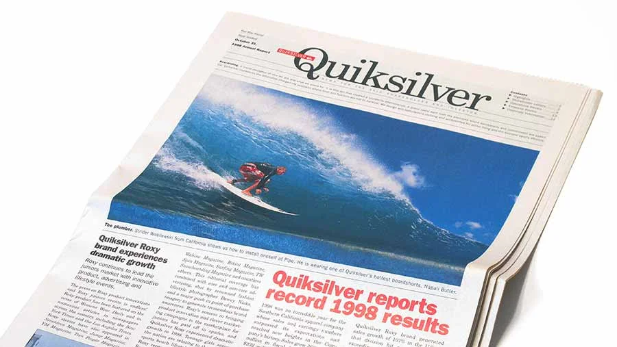
One of his earliest report projects that he designed at the firm was the 1998 Quiksilver Annual Report. The company was growing fast, partly thanks to a corporate brochure Michael designed earlier which helped cement the company’s distribution partnership with Nordstrom.
The Quiksilver report project was his baby, and he worked alone on it. Long story short, he and his design team came up with a theme that fit with Quiksilver’s messaging that year, and Michael nailed the concept that produced a successful report which strengthened the firm’s longstanding relationship with the corporation.
1. Surprise the stakeholders
Michael designed the 1998 annual report to look like a newspaper, in part because the big company news at the time was that they were experiencing record growth. To get this message across quickly to Quiksilver investors and stakeholders, a painstaking effort went into making sure the newspaper looked legit. Michael made sure the typography looked authentic, complete with terribly-justified type in too-narrow columns, with crappy rivers and all.

2. Capture the attention of their audience
Delightful elements were added such as Quiksilver-red surfboards for the graphs. The board graphs became an enjoyable favorite for the company and were used as a graphic element representing growth for each annual report thereafter.
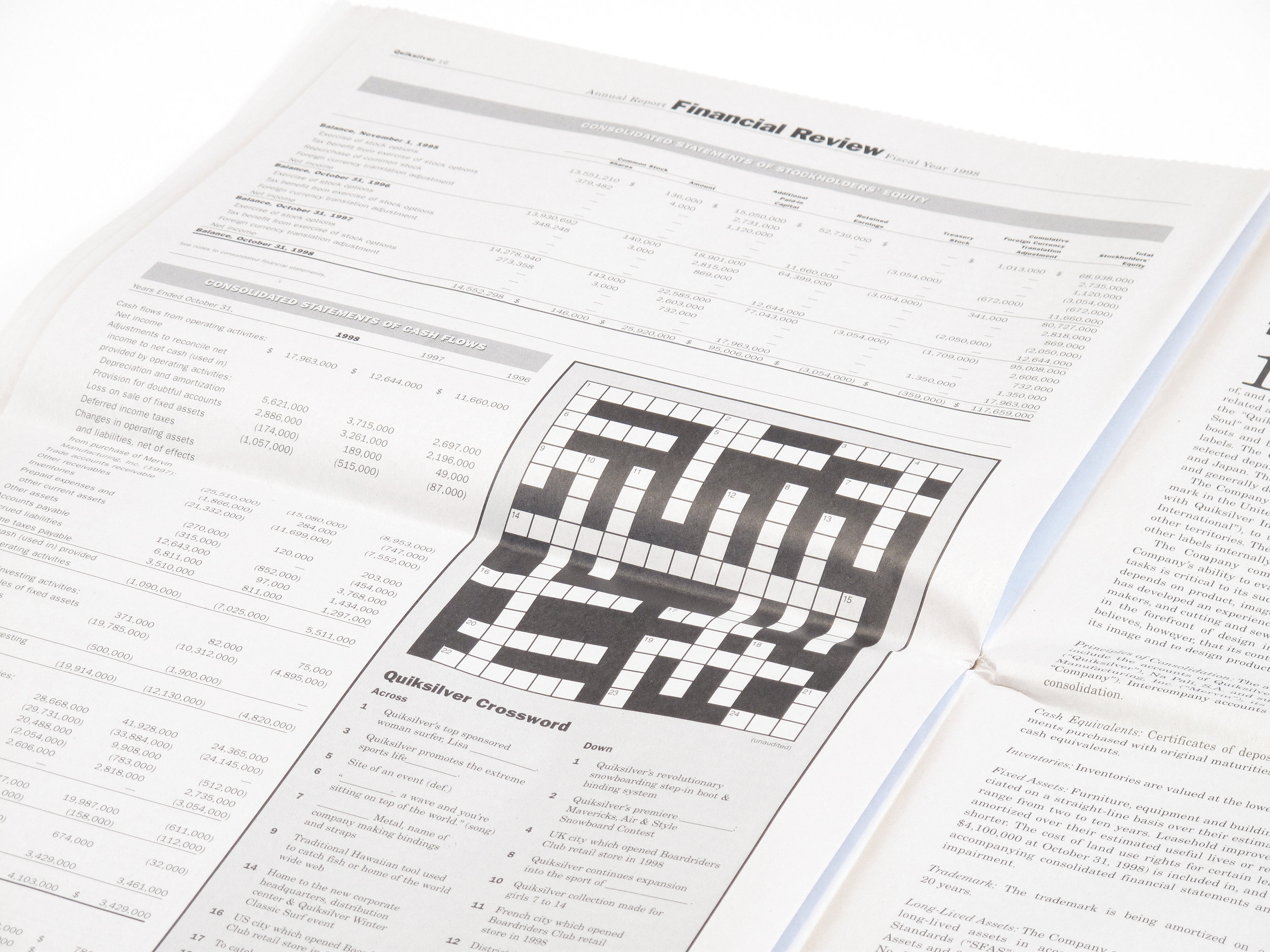
To add to the feeling of authenticity, Michael also wrote and designed a functioning crossword puzzle in the financial section. Credible-looking details using recognizable typography give the reader an engaging double-take.

3. Save budget in time and costs
For this much copy on a broadside sheet as shown on the Letter to Shareholders spread, a designer or design team can save hours of modifications and changes if they know what they are doing. Notice the full-justified text fitting to the bottom of the page. The lack of white space in this layout means changes have to be carefully managed with the client.

4. Impress your clients
Michael arranged the first finished print that left the web press to be delivered in its cellophane-wrapped bag to CEO Bob McKnight’s doorstep before dawn. Michael got a call first thing in the morning with much praise.
5. Get repeat work
Well, I’m sure you knew already, but the client kept coming back. Michael continued to design the report every year for another four years until he left the firm, and the design firm still to this day (20 years later) continues designing the corporation’s annual report.
A newspaper format without the authentic typography to fit the theme is a missed opportunity. A great design idea without flawless execution can create mistrust. To me, this is why typography (and the grid) is important.
The key to good typography is no secret, but it is definitely a mindset that takes repeat practice for mastery. I don’t have to tell you, as you’re already working towards these goals.
Great ideas deserve great execution. Go and nail it.