

Blog Articles

Are you quoting dumb or smart? If you’re using InDesign, your default is smart.
Typographer’s quotes (otherwise known as smart quotes or curly quotes) are a default preference in Adobe InDesign. To find your preferences in InDesign, go to Preferences > Type.
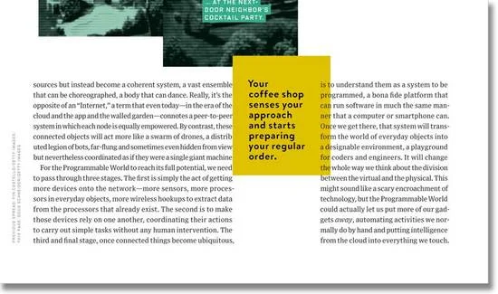
Just like a smooth cup of coffee or a cozy warm blanket, a beautifully-set justified paragraph… just feels... so… right.

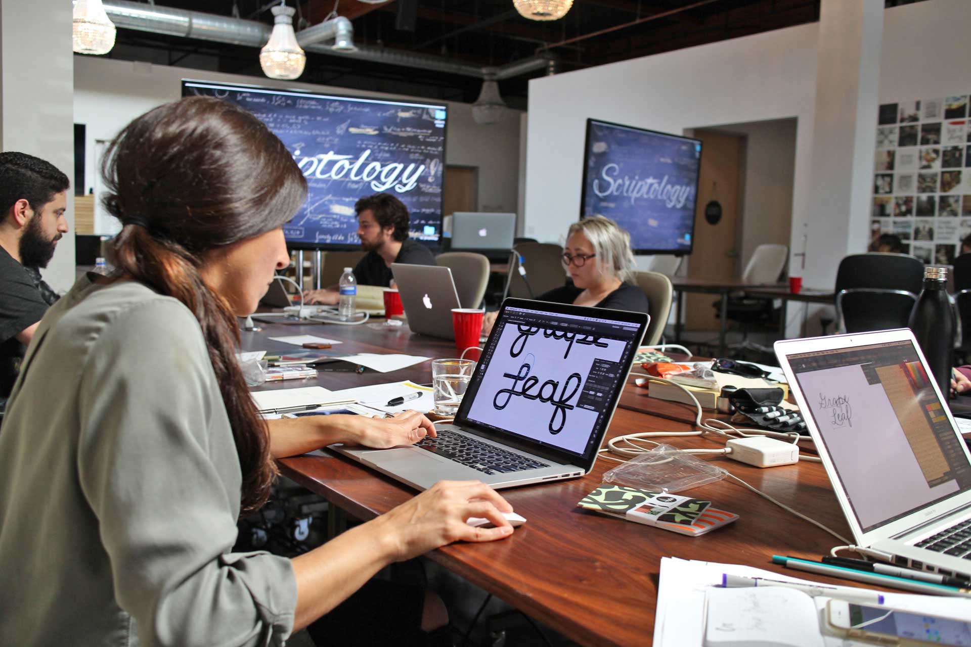
Scripts are a great way to add elegance and personality to any layout. However, with swashes, connectors, alternate characters, and casual handwriting styles, script fonts can sometimes be difficult to read.
Depending on what you’re using them for, you may need fonts with more readability and less style. For the ultimate scanability at large sizes, or readability for introductory paragraphs of up to 35 words, you will want an extremely easy-to-read script.
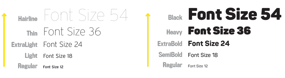
More than once, I‘ve heard this question from young designers, “why should one know typography? So-and-so just did their own thing and now they have 50K followers on Instagram.”
When it comes to recognizing good design, many designers (and clients) say they know it “when they see it.” So when it comes to the act of designing, maybe it’s why some designers jump straight to the computer and move boxes around the page until the stars align.

Every once in a while, we bring our Wine & Type Pairing social event to designers, and we like to share our method of pairing typefaces to make the process easier and faster. In this mini-workshop, we reveal three ways to pair typefaces together in a quick and easy method that saves time for designers.
Two typefaces create a solid foundation for any type system, and here is our process for building a two-typeface system.

The bridge between the amateur designer and the professional designer is typography mastery. And although theory, tools, and tactics are part of a well-rounded skill set, it’s just as important to possess a growth mindset to really master your craft.
Let me explain.
A mindset is a belief or attitude that orients the way someone handles situations. It predetermines the way a person interprets and responds to a circumstance.

I’m going to ask you to be honest with me, and I’ll be honest with you.
Why is it important to you to improve your type and design skills? For us, it's to keep the lights on and allow us to keep doing what we love.
Precisely ‘nailing’ a concept pays the bills. How?

Name brands that are part of our vernacular don’t become everyday nouns and verbs by accident. Such brand organizations have a voice in our world that we resonate with.
We personally align ourselves to brands that symbolize our values, knowing they help us identify with others who share the same ideals and strengthen those connections between each other. We use brand names, logos, taglines, colors, and messages as smoke signals in a noise-filled world.
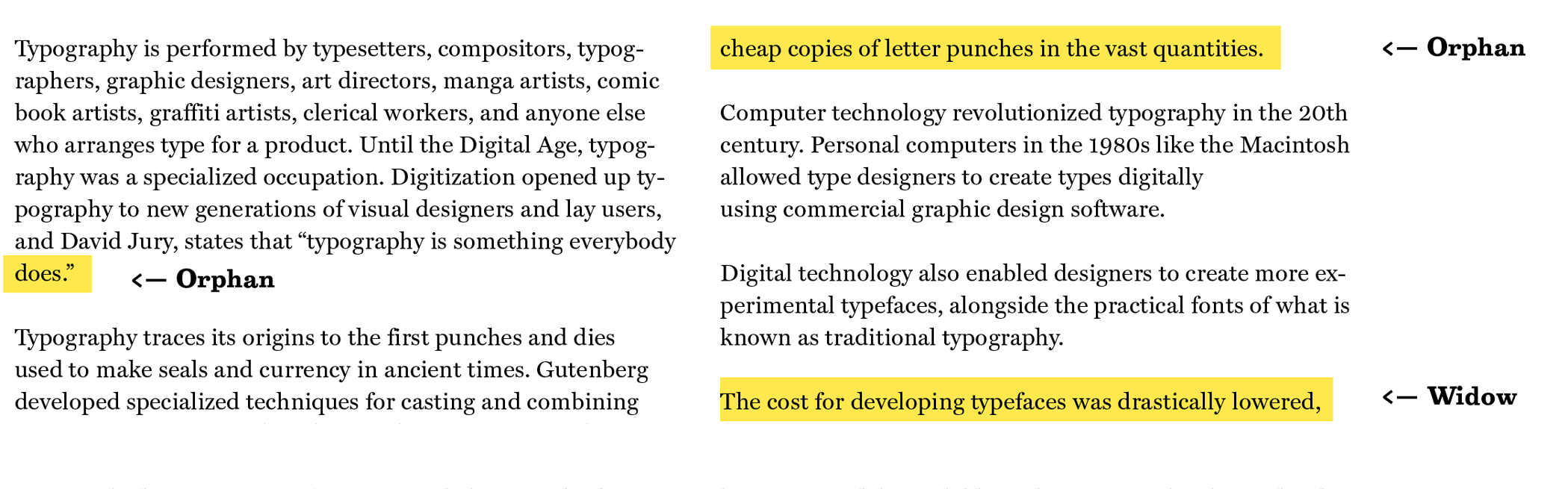
Sometimes I’m scared shitless of saying ‘counter’ when I mean ‘bowl,’ and vice versa. Why? I might get jumped on by the type community on using the correct terminology. So imagine my anxiety when I start saying the word the word ‘orphan.’ Why? Because the two terms ‘orphans’ and ‘widows’ are interchanged all the time.
Names of things do not typically affect what they really are. Whatever their names both of these type crimes are still very painful to look at.

I enjoy working with people who are serious about learning more about typography and make strides in their work. Those of you who have taken my Boot Camp Clinic know how repetitive drills can train your typesetting muscle memory and sharpen your eye.
Are you that person? I'd like to help you improve the typography work by spending some time reviewing your work and giving feedback on your projects. Jump on a private face-to-face portfolio review with me to gain some specific tips and changes to help you improve your type.

“The devil is in the detail” is an idiom for that which is small things are often overlooked and cause problems later on. Much like a beautiful wine glass with a hairline crack. Although tiny details seem insignificant, the imperfections disrupt an experience, because they too are essential to the whole.

It’s been a little more than a year since I began my interview series, Typography Dojo, and I feel like I’ve learned so much along the way from typographic masters!

I was taught to handle both ends of the type spectrum. Meaning, you can hand-draw type, which is lettering, where you’re handling three or four words at the max. I was also taught that a good designer has to be able to handle 300 words or more on a page in typesetting. A good designer needs to handle both.
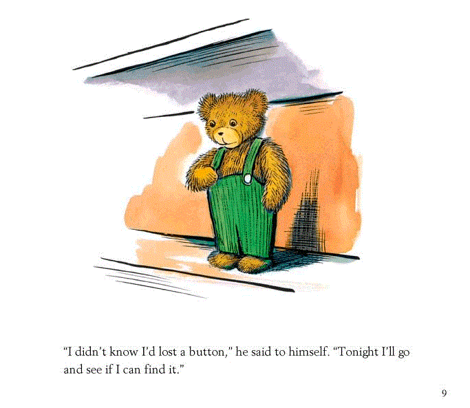
I grew up with children’s books, and truly loved the stories. Every evening, a favorite book of mine renewed a spark of imagination before bedtime.

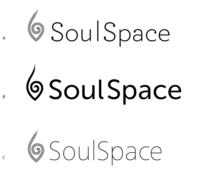
Graphic designers spend a lot of time trying to figure out where to start with pairing typefaces to symbols.

What is a “Q”? What is the morphological essence of a letter? Such questions led to an experiment that taunted the limits of legibility in order to better understand the character-recognition processes of the human mind.

I've been teaching interactive design for 15 years at the University level, and one thing that has remained the same, is that the industry and code standards are always changing.

Most people work with inches when designing their pages. Makes sense, right? We are used to working with inches when we start designing because that’s the physical measurement unit of the format, and where we typically start: the size of the flyer, brochure, box, etc.

Gemma O’Brien is an Australian artist and Volcom Womens Ambassador specializing in hand-lettering, illustration and typography. In her spare time, she travels and illustrates puke-puns on airsick bags for The Spew Bag Challenge.

From almost 20 years of typesetting experience coming from annual report design, we've amassed a reference collection of over 1,500 well-designed reports spanning the last 40 years. We'll bring out the best examples of great design and show you what we've found makes great typography.

Anyone can make a headline look beautiful, but keep the attention of the reader throughout the body copy so they'll want to turn the page and read more? That's your challenge.
Video Lessons
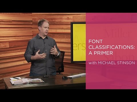
In this clip from the CreativeLive class, Pairing Typefaces: Tips for Combining Fonts, Michael talks about the primary type categories and how to differentiate between them for better pairings.
For the complete class check out the course page: http://cr8.lv/1BJrTwX
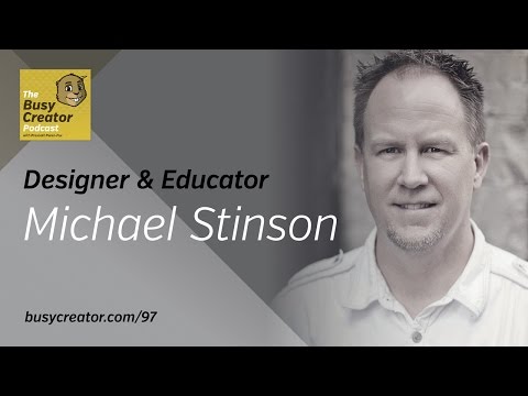
Michael Stinson (@MWStinson) is a veteran designer, educator, and business owner. In addition to his work as a professor of graphic design, he also runs Ramp Creative, a branding studio in Los Angeles, as well as Type Ed, a dedicated typographic education business which helps creative pros return to form in the fields of typesetting and layout.
Together in this conversation we unravel some of today’s worst typographic habits, and how to overcome them, share a few tips that all creatives can use to improve their type usage, and discuss some processes for working with clients.
Check out more videos on the TypeEd YouTube Channel
As Featured In





Say you have a new client who hires you to design their company identity. When beginning design directions, where do you start? What types of logos should you present?
There are five different types of logos, or six, if you include characters/mascots.