

Ascenders make the heart grow fonder.
Comment with your most creative typography-related pick up line. A random winner will be chosen to win a TypeEd tee shirt (valued at $26) delivered to your door! Entrants must reside in the United States or Canada to win the tee. The winner will be announced and contacted on February 16, 2014. Good luck!

Anyone can make a headline look beautiful, but keep the attention of the reader throughout the body copy so they'll want to turn the page and read more? That's your challenge.

How do you choose a typeface? Do you browse through fonts online and make educated guesses? Typefaces hold history, personality and unique details in their characters, to which you, as design have to "cast type" in the role of your storytelling design, being the "movie."

We move through information with visual cues. Good user experience (UX) creates preference and influences memory. Typography can add value by simplifying information hierarchy of websites, apps and other digital media.

Ascenders make the heart grow fonder. Comment with your most creative typography-related pick up line. A random winner will be chosen to win a TypeEd tee shirt! Entrants must reside in the United States or Canada to win the tee. The winner will be announced and contacted on February 16, 2014. Good luck!

TypeEd brings the craft of typography back to graphic design education. Directed & Edited by Steve Anderson. Participants include Claire De Leon, David Defeo, Clare Jensen, Zachariah Khan and Rhoel Paghunasan.

Zach Braff told us some jokes per Rachel's request, although he had no clue what they meant. Maybe he could use a typography class!
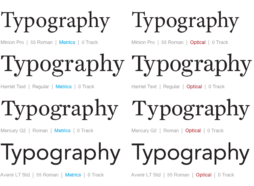
There's been so much debate between the automatic kerning settings between using Metrics and Optical in Adobe InDesign. In our classes, we've touted a combination of using Optical plus manual kerning for headlines in most instances, but have also seen instances where using the Metrics default works nicely too.

Ana Gomez Bernaus is a visual adventurer who landed in Los Angeles. Born and raised in Barcelona, Ana studied graphic design there but she was also drawn to illustration. Barcelona and its Catalan modernism style influenced her early work, creating fascination with the rich ornamentation and the details. When she decided to move to New York, she fell in love with typography. Barcelona brought her a taste for illustration, New York allured her with typography, and now both disciplines live in L.A., with lettering.

Los Angeles-based artist (who just recently moved to Austin), Angela Southern earned her advertising degree from Michigan State University and graduated from a small portfolio school afterwards. She learned her craft as a lettering artist and illustrator on the job as a sign artist at Trader Joe's from other professional lettering artists at the company and became good at cranking out lots of artwork under deadline.

One message that many of our guests have shared is the importance of mentorship.