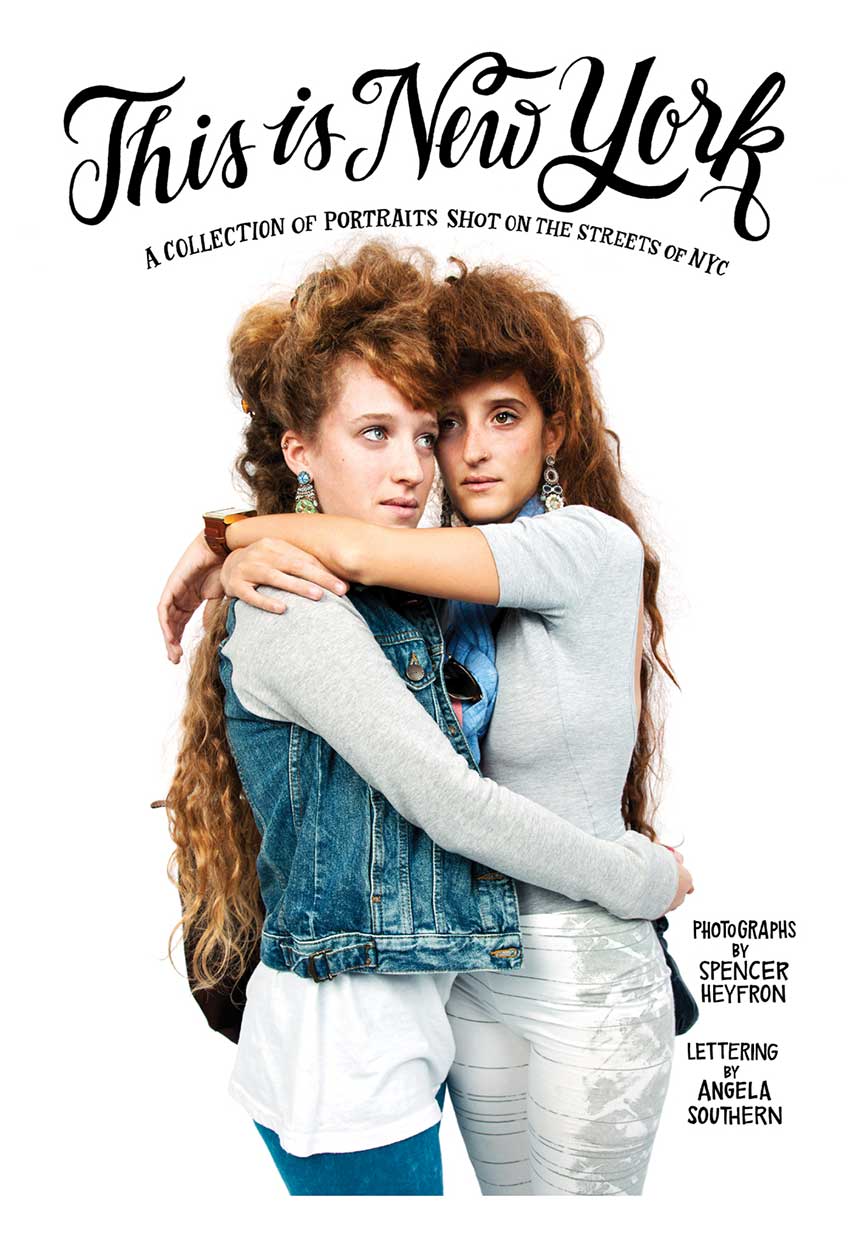
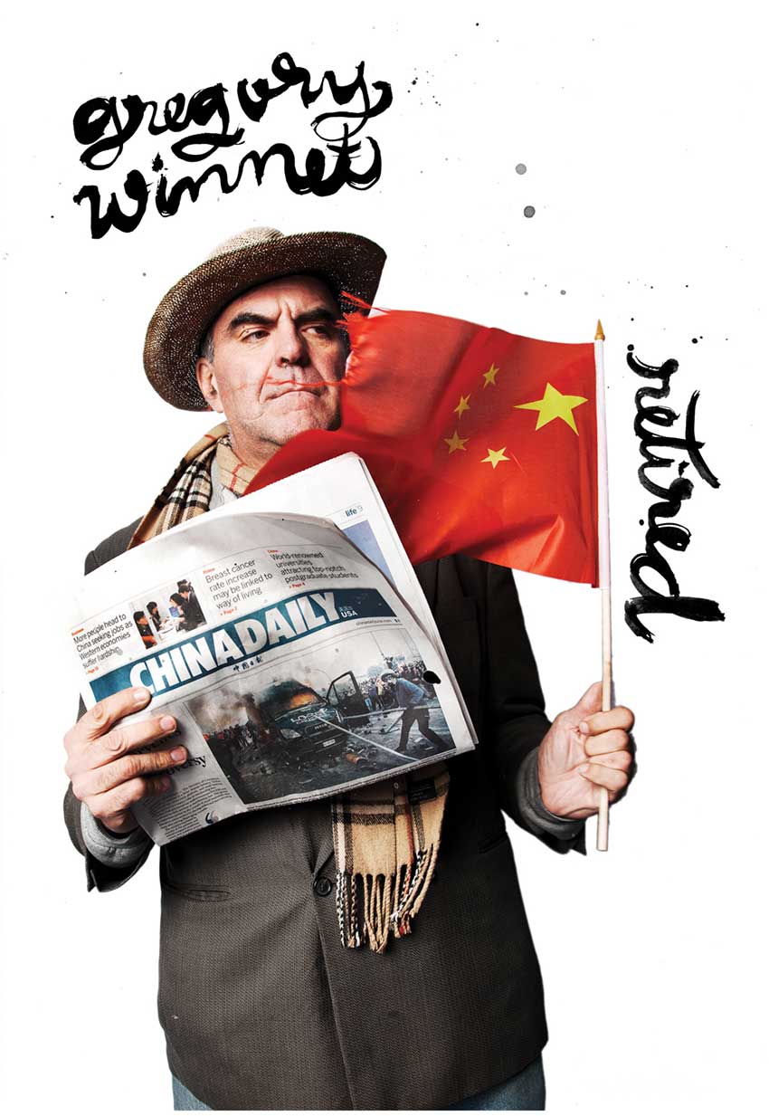
Los Angeles-based artist (who just recently moved to Austin), Angela Southern earned her advertising degree from Michigan State University and graduated from a small portfolio school afterwards. She learned her craft as a lettering artist and illustrator on the job as a sign artist at Trader Joe's from other professional lettering artists at the company and became good at cranking out lots of artwork under deadline. Her latest collaboration called "This is New York" is a photo series with quotes from real people.
What influences you most?
Other hand lettering influences me, and I'm always fanning the flames with other peoples' work on Pinterest, Behance and Dribbble.
How did “This Is New York” come about?
This is the kind of project I had been dreaming about. The super talented photographer, Spencer Heyfron, and I shared an agent, (Snyder New York), who suggested we pair up for a project. Spencer had the idea to create a NY "Lookbook" of sorts, and my lettering style fit his imagined aesthetic perfectly. The piece is called "This is New York," featuring 27 pages of portraits shot on the streets of NY, a quote from each person, and their occupation, interpreted in my hand lettered style. It's a collaboration we both wanted to use as a fresh promotional piece, showing the kind of work we want to do more of. It was a blast, and I savored the freedom to do whatever I felt would work. Spencer had already taken the photos, collected the individuals' quotes and started to imagine what the project could be.


The photos have so much personality. Did the quotes inspire you in any way?
The quotes totally swayed my style, on purpose. I let the message sort of dictate what the lettering style would be. I tried to let it happen naturally, and really let the information I had about each person influence the lettering style in an honest way.
How did you go about the project?
I had total freedom to create the lettering, and came up with about six unique styles to use in rotation for this project. I studied each portrait and let my imagination explore the possibilities of each page, depending on the white space available and portrait, quotation and occupation of each person.
Most of the pages were done by; laying a blank page over my screen, sketching an outline of where the white space would be, and inking the lettering on paper within those boundaries. I got messy with ink and brushes, calligraphy, marker and felt pens. I printed a few of the trickier portraits onto actual size paper, then inked on those to get an accurate fit. I scanned the raw artwork, and combined it with the portraits in Photoshop. Some of the art was cleaned up a bit, but some of my favorite pages were ones I left a little "dirty," with a really handmade feel. I did lots of versions of each page, choosing my favorites and talking with Spencer about his favorites. It was exciting the whole time, and although it was a lot of work, I savored every minute.
Spencer is a blast to work with, and I really admire his work.


How was it produced?
It was made to be a promo and mailed to lots of prospective clients. We printed it on high quality newsprint, with each page folding out to about 16.5" x 11.25". It's been gaining traction. The thing won't die! It was featured on PDN's Promos We Kept, Behance, their related site Inspiration is Served, and will be featured in Computer Arts Magazine, Chois Gallery quarterly magazine and Communication Arts Typography Annual.


Thanks, Angela. The promotion is beautiful. To see more of Angela's work, visit her web site.