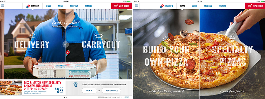
Monotype had been working with Crispin Porter + Bogusky on licensing the Trade Gothic family, used brand-wide along side the custom Pizza Press fonts for Domino’s Pizza. They had designed illustrations of decorated letters, and needed them to be in font format to help speed up design production and generally make life easier.

Terrance Weinzierl, an in-house type designer at Monotype, was put to the task. He told us that his mom was an industrial designer in the toy industry for 20 years and an amateur calligrapher, so he was exposed to the arts at a young age. Since 2008 he has worked on custom fonts for Google, Microsoft, Barnes & Noble and more.
What direction did the client give you?
The custom chromatic design had to match stylistically with Trade Gothic. So, I really had a specific place to start. I researched and examined other chromatic fonts and the origins of Trade Gothic dating back to the 19th Century, but we still needed the new fonts to look like ‘contemporary Americana.’ There were some things, like the spur on the G, or the flag on the 1 that were influenced by limitations of the inline weight.


Explain some of your research process.
I looked at some Gothic origins in old ATF catalogs. I studied Gill Sans Shadow to learn how to make the illogical shadow adjustments that are required for optical weight balance (like the S or diagonals of N and M, for example). The shadow is not just a straight extrude, there are some cheated angles to make them look right.
I admit, I’m not great at research. I don’t have a formal process. I’m probably too impatient and am the most excited at the beginning of a project. I usually bounce back and forth between drawing and research, looking up things when I get stuck on a certain problem. Trial and error is my jam. At some point, you need to stop looking at other people’s work, and start making your own!

How did you know when you were finished?
It’s hard to know when to stop, especially if you’re working alone. You could work on a typeface for far too long. Deadlines are necessary, either from a client or self-imposed. My mantra is ‘progress, not perfection.’ If you find yourself working in circles, set it aside for a while and come back to it. Or, call it done, and move on to the next one. I think it can help to plan on throwing away your first few attempts or prototypes; that’s the practice before the race.
Were you happy with the results?
I’m really happy with the Domino’s work. I like the whole campaign CP+B put together, and they used the custom fonts well. And of course I would like typographically-rich pizza packaging!
I’ve worked very hard on many projects where I remain anonymous, and I think that happens to a lot of designers. I had been working towards and waiting for a project like this for 5 years, there are no overnight successes! I’m very pleased to be able to share the story, and have my signature on the typeface.