Becca Clason is a lettering artist living in Salt Lake City where she handcrafts letterforms from food, products, or flowers. She started making lettering in college to decorate mix CDs for boyfriends or handmade greeting cards. It wasn’t until a few years later when she started seeing design blogs feature lettering work by Jessica Hische, Friends of Type, and others, that she learned what lettering was and that she wanted to do it for the rest of her life. Recently, Becca designed a set of delicious-looking animated Amex cards for the American Express Card Art Series, so naturally, we asked her about it.
How did you learn about typography and first get into food lettering?
I learned the basics of typography and its history when I was in college, but working professionally for several years has been invaluable to what I’ve learned about typography. Until I became aware of lettering, I thought that all designed letters were font-based. I didn’t understand that many of the creative lettering designs I saw had been first created by hand. I learned graphic design and typography on the computer, and even after I started scanning and vectorizing my work, I still couldn't break away from digital design—it was outside my comfort zone.
A little over a year ago, I finally stepped away from my computer to create, and I haven’t looked back.
I had a garden in my backyard in Los Angeles near Santa Monica, before my husband and I moved to Salt Lake City. After picking a big load of vegetables to make some fresh salsa, I set everything on the kitchen table, and then on a whim, I arranged the vegetables on the table to make the word “fresh”. I styled some leaves and the rest of the vegetables around the word to make it look pretty. I had so much fun bringing my lettering into the three-dimensional world that first time, and I’ve always loved art directing photoshoots, so I was hooked.
I’d been inspired by Tommy Perez’s A to Zoe project with food, and by some others who create three-dimensional lettering like Casey Ligon, Danielle Evans, Marian Bantjes and Stefan Sagmeister. Several years ago, Sagmeister created the first food lettering I’d ever seen for his Kickstarter campaign for The Happy Film. I have thought about that watermelon lettering so many times since then.

What were the parameters for the American Express project?
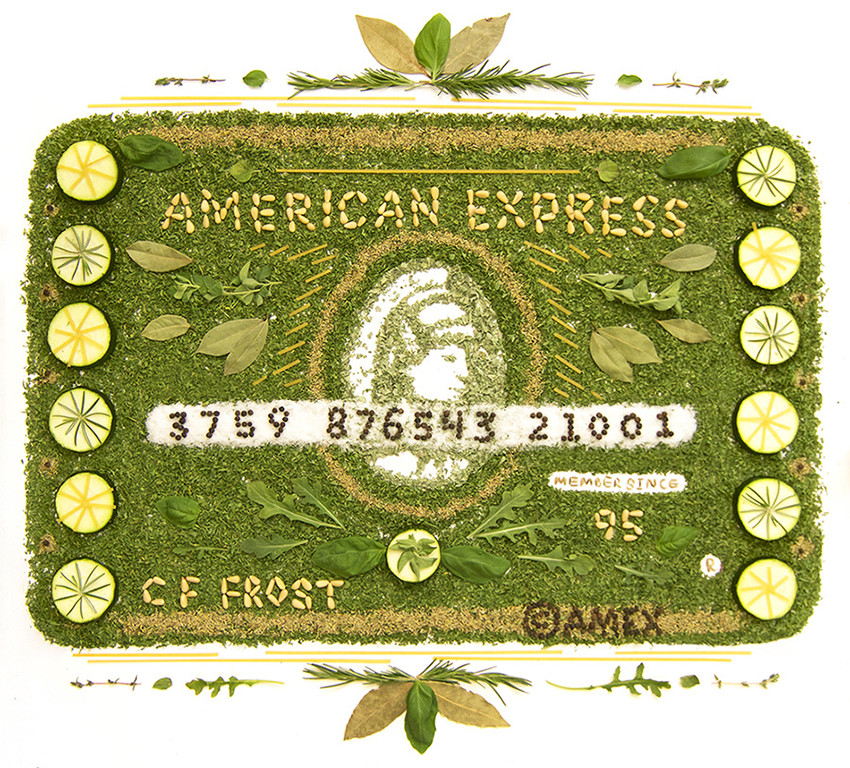
Through the agency alldayeveryday, I was commissioned to create my interpretation of American Express cards as one of the artists in their social Card Art series, which was posted to their Facebook and Instagram accounts. There were specific details on each card that had to be there, like the centurion in the middle, “American Express” across the top, the account number, “member since '95,” and © and the ®, and the card holder’s name.
Right before we kicked off the production, it was decided to make these into stop-motion videos rather than still images. I was extremely excited and extremely nervous about being able to show such small and precise details with the food materials and to be able to pull off professional stop-motion videos. I’d done some smaller-scale stop-motion projects before, but this was going to be my biggest one to date. I’ve come to realize that the projects that push you out of your comfort zones are always the ones that with get you the best reactions.
Alldayeveryday wanted me to come up with some mood boards and sketches for my concept. I was required to create a design and animation for the American Express green card, gold card, and platinum card, so I selected different ethnic food styles that fit into these color schemes.

Tell us about your decision-making process and design process.
For the green card, I decided to use Italian food: dried and fresh herbs, pine nuts, uncooked linguini, spices, and zucchini. For the gold card, I chose Indian food: yellow lentils, garbanzo beans, potatoes, lemons, ginger root, and spices. For the platinum card, I chose ingredients for French pastries: black sesame macarons, a couple kinds of silver sugar sprinkles, sugar, eggs, measuring spoons, and wire whisks.

The client approved my sketches and proposed materials, and then I was off to production!
Basked off my sketch, designed the green card first. It took my 12 hours to create by hand and to remove as I photographed. The post-production/animation took around 12 hours as well, since I was learning as I went. The gold card took 11 hours to create by hand and to remove as I photographed, and the post-production/animation work took 8 hours. The platinum card took 8.5 hours to build by hand and remove as I photographed, and it took six hours to edit.

I learned a lot from this first major stop-motion job with American Express, and I’ve also learned how to be much more efficient with my time. My current process helps me spend much less time in post-production now. The right equipment, computer programs, and planning ahead make all the difference in the world.
I have an actual production studio in my Salt Lake City home now with camera mounts and light stands. My husband assists me with the camera work and lighting, because as a filmmaker, he's awesome with that kind of stuff, but when I worked on the American Express project, I worked on my dining room floor, using a tripod and a camera remote so I could do my best to avoid touching and bumping the tripod and camera as I worked.