

Although there's been many ideas on how to save ink by selecting different typefaces, designing one specifically with the goal to save the world is both an applaudable and ambitious effort.
Ryman Eco, developed by Grey London is being touted as the world's most beautiful sustainable font, because the outlined letters use 33 percent less ink.
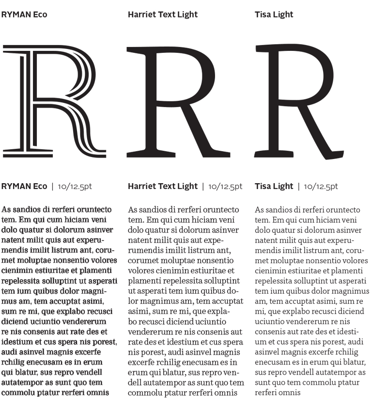
However, typography is all about considering the reader. Once printed, reading this typeface is hard on the eyes. And it's difficult to focus on the words. That's because the balance of the visual weight from character to character shifts. The stem on the R is filled in when printed, and the bowl is left open. On a numeral zero, the tops and bottoms of the counters are filled in and the sides look too light. The overall color of the paragraphs look fuzzy both on screen and in print.
And as a typographer's tool, it's not very practical because there is only one font weight offered. So no hierarchy can be established with this face.
The way to be 'sustainable' using a font would be to select a lighter text weight of a well-designed typeface, ones that are big and thin (such as Harriet Text Light and Tisa Light), that's easy to read and also saves ink.

Ryman Eco, used on the EULA, printed and seen through the loupe.
For more info on TypeEd and our thoughts on typography in general, be sure to sign up to our mailing list.