

A lover of science who decided on a career in design, Cal State University Long Beach student Susie Thai naturally takes a scientific approach to all her work. Blood Type followed the themes she explores in her process.
What were the parameters of the class project?
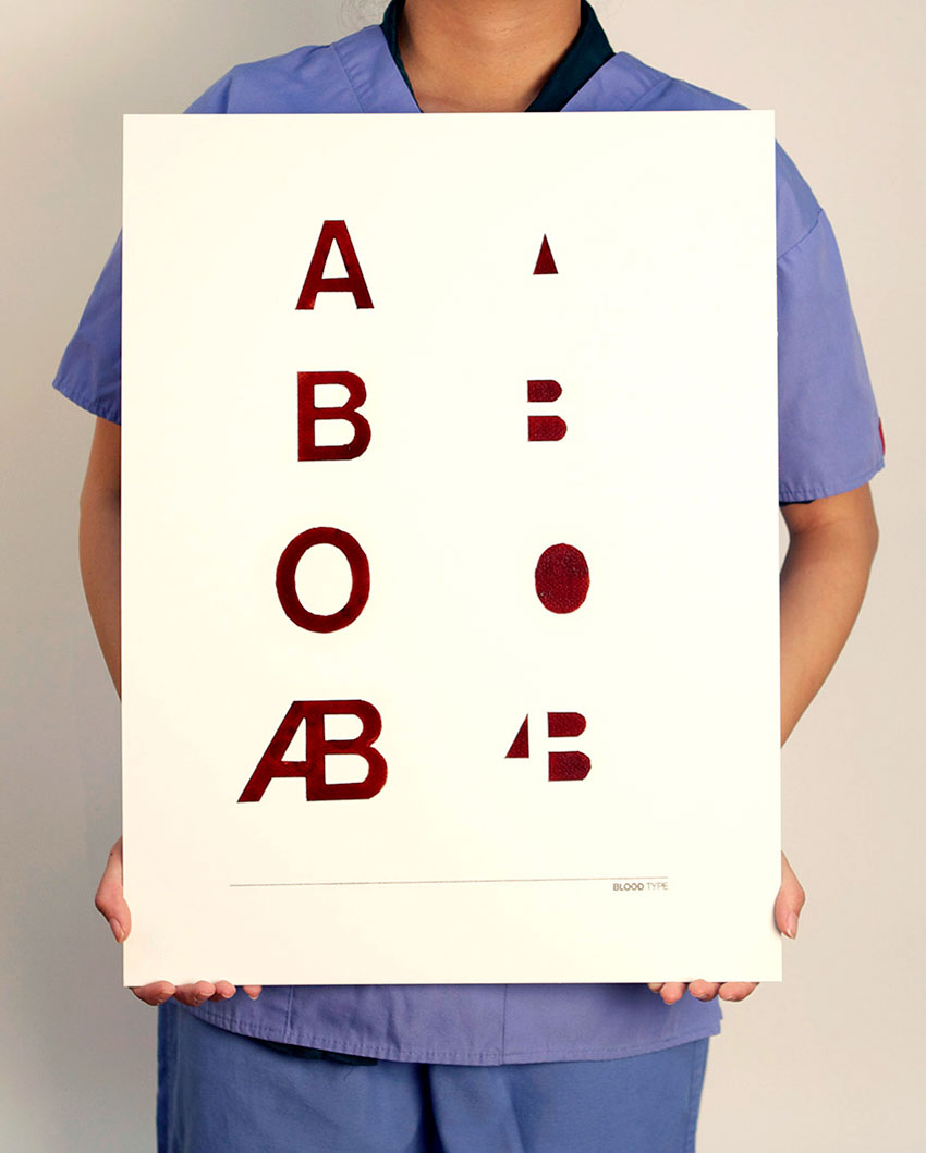
Blood Type is a self–initiated project that stemmed from a class project that didn’t work out. The assignment in Graphic Design VI: Advanced Topics class with Tor Hovind was to create a series of experimental book covers, and I’d chosen Clive Barker’s Hellbound Heart and its unreleased sequel The Scarlet Gospels, which are the books behind the Hellraiser movies. Eventually, that project was scrapped and a box full of vials of my blood sat in the freezer unbeknownst to my household. I didn’t know what to do with it for a while.

So, how did you come up with the idea? What was your process for execution?
The idea made its way into my head when I had to submit medical forms for a project trip to Hong Kong. I needed to get tested for my blood type, and the experience of having my blood drawn again made me think of the vials sitting at home. I’m sure my inner dialogue went something like: “Getting my blood drawn… hand–drawn type with blood? Blood Type—oh snap it’s an idea!” So I spun this idea around with a few classmates and, thanks to my friend Lucas, developed the concept further by having the negative space represent the negative types.

Another friend of mine, Jennifer, a nursing student, drew the blood from me. It was just a matter of finding the cleanest way to paint the letters onto the surface with the cleanest absorbency—I wanted this to look clinical, not gross. I quickly found out how finicky blood can be as a medium. There’s an organic film that congeals on the surface as it dries—great for sealing off wounds from infection; not so great to deal with when you’re trying not to flick specks onto your art board.
I masked the letters off with painter’s tape and frisket, and then painted the blood on with a paintbrush. I also used a syringe to touch up parts of the letters that were congealing unevenly. For mistakes, I scraped off small dried flecks with an X–Acto blade. Large mistakes meant I had to start over, so I did a few test runs on a practice board before I moved on to the final piece.


Why did you choose Akzidenz Grotesk?
I chose that typeface because this project has been a series of amusing puns to me. I knew I wanted to use a sans serif. They’re “plainspoken.” I didn’t intend to make this poster as a testament to how beautiful the grotesque is or to show off my calligraphic skills. I just wanted to make something that’s exactly what it is. Here’s a fun fact: Akzidenz Grotesk is an official font of The American Red Cross.
Very nice. View more of Susie Thai’s portfolio at her website, susiethai.com.


