Not all body copy is created equal, but the way it’s typeset should be clean and easy to read. Reading copy is most effective set with medium line lengths, even horizontal rhythm and large-enough x-height so that it’s inviting to most audiences.
Stop Exhausting Your Reader
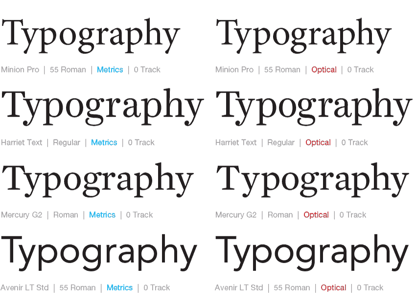
The Great Debate: Metrics vs. Optical
There's been so much debate between the automatic kerning settings between using Metrics and Optical in Adobe InDesign. In our classes, we've touted a combination of using Optical plus manual kerning for headlines in most instances, but have also seen instances where using the Metrics default works nicely too.


