We want to read what you have to say, but long lines of copy are laborious to read. And when readers have to put in too much effort, they will move on to something else, well, at least I do. How can we design a more comfortable reading experience?
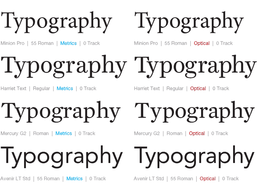
The Great Debate: Metrics vs. Optical
There's been so much debate between the automatic kerning settings between using Metrics and Optical in Adobe InDesign. In our classes, we've touted a combination of using Optical plus manual kerning for headlines in most instances, but have also seen instances where using the Metrics default works nicely too.


