Ed Benguiat had once said, “I do not think of type as something that should be readable. It should be beautiful.” And in 2013, type choices were gorgeous. It was a scriptaculous year with the interest in script type, hand lettering and calligraphy was at an all time high. Perhaps it was a bit of penmanship nostalgia due to our increasingly digital lifestyles or the fact that cursive handwriting is starting to disappear from public classrooms. Whatever it might be, we're glad that people love it.
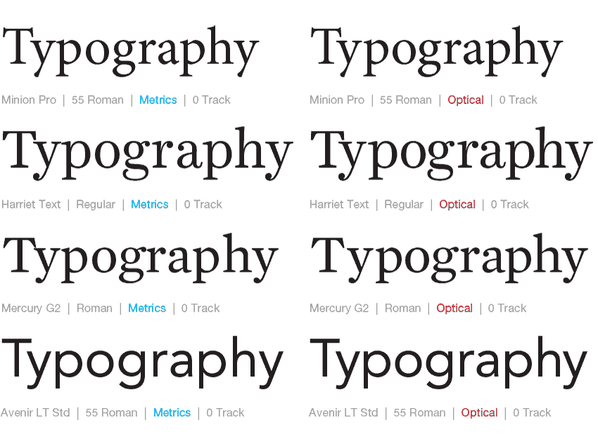
The Great Debate: Metrics vs. Optical
There's been so much debate between the automatic kerning settings between using Metrics and Optical in Adobe InDesign. In our classes, we've touted a combination of using Optical plus manual kerning for headlines in most instances, but have also seen instances where using the Metrics default works nicely too.


