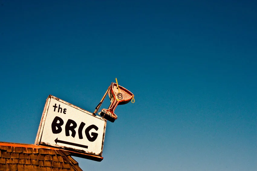
Corey Miller was drawn to the entertainment business so he got his degree in film and television studies at California State University, Northridge. He became a writer and producer for television with credits including CSI, CSI: Miami, Body of Proof, and Reckless. However, living Southern California, he always noticed vintage signs while driving around, so he started to capture them. These beautiful images really got our attention.
What inspired you to capture these signs?
Los Angeles is still a relatively young city, not known for some deep history. History does tie in greatly with car culture, and neon signs were manufactured in order to draw people out of their cars and into the local businesses. And as I began to experiment with photography, around six years ago, I also began to notice some of the signs that I was familiar with around my area began to disappear. These were great signs dating back forty or fifty years, many of which had wonderful design and typography. And they were being dismantled and being cast aside like they were nothing. So I began to take photos of some of my local signs, for posterity. As my love for the signs grew, I began to see them in a different way, and my photography began to evolve.
Definitely, a great way to 'collect' the relics of the past. What about them captures your fancy?
I am drawn to them for many reasons. Sometimes, a sign can just be a marvel of engineering and artistic design. I am inspired by the work put into the sign — in crafting the neon tubes, or shape, or typography. Sometimes I see them as nostalgic symbols, of a time in America that has long since passed. Some also have a melancholy feel — there is something very photogenic about how a sign has withstood time, weather, and neglect. I think each sign tells a story of some kind.
Will you do anything with this collection? Exhibit? Publish?
Since shooting signs has just been a hobby for me, I have been primarily shooting and posting photos on Flickr and Instagram. I have met many other people who share the same interest through those sites, and the community is becoming very close-knit. Over a dozen of us just recently met in Reno, Nevada and wandered the streets together shooting vintage signage. But I have also been fortunate to have attracted others to my work through those sites, and as a result have been published in several books, magazines, and online features. I have also had photos appear in the National Register of Historic Places brochure, in several art galleries in the U.S. and abroad, and even in a permanent exhibit in a bowling museum in Texas. It's been fun. Eventually, however, I do think it would be fun to put together a book.
What is it about the typography that interests you?
You know, I wasn't a design major, and couldn't tell you anything about typography on an intellectual level. All I can say is that I love the feeling typography evokes when someone uses it correctly. How it provokes a feeling just from its style, regardless of what the actual words are saying. Typography can make something feel regal. Or serious. Or playful. Or romantic. Or they immediately launch you back into the past, with a feeling of nostalgia. That's powerful.
The type at Premiere Lanes is great. The alternating baseline is a good sign that it was built in the 50s. Can you share any very unique typography examples in your collection?
Sure! I have shot many examples of great typography in the over one thousand signs photos I've put up on Flickr. But here are a few that I particularly enjoy, because of the reasons I just mentioned. They provoke an immediate feeling.
Goody's Coffee Shop (sign now gone). This is a great Googie typeface, which evokes nostalgia for a time long since passed. This sign, in San Gabriel, CA, is now gone. It's turned into Jeff's Sporting Goods, and though they did attempt to keep the Googie letters, it's still not the same.
Cora's Coffee Shop. I like this script font because it gives the place a cozy feeling, just by its sign. Santa Monica, CA.
Starlite Drive-In. Another typeface brimming with nostalgia. South San Gabriel, CA.
Sahara Motel. This one is interesting because it immediately tells you it's trying to imitate a Middle Eastern style with its script. Anaheim, CA.
Sno-White Linen and Rental. This one draws the eye right away because of its large script and style. It feels playful, inviting. In Colorado Springs, CO.
Thanks, Corey! For more of Corey's images, view his amazing Flickr collection or follow toomuchfire on Instagram.


