
In the interviews I’ve conducted, I’ve learned so much. I’m going to give you a sneak peek of what is in store for you.
I’ve been practicing graphic design for 14 years, and teaching interactive and graphic design for 18 years. And throughout this time, I’ve been wondering what makes good graphic design? In design annuals and competitions, what do design juries look for? What about the typography makes a design piece great? Why do some agencies get more design awards than others? Some of my design juror friends have told me, “it’s basically typography.” The practice and the use of type that makes a piece either work or not. It either demonstrates expertise or demonstrates amateur design.
So I started asking people, people who I felt were experts in type and typography. And I documented the interviews. And I start my quest to find out the secrets of good typography from these people, as well as my partner, Michael Stinson, who has way more experience in working with type than I. Through this series, I hope to uncover the secrets of mastering typography. And find actionable tips that we can use right away in our graphic design practice.
Please help us out and leave the Typography Dojo podcast a rating and review on iTunes to let me know what you think! Your submission will help others become aware of the podcast and help spread the good word of type.
See you in the #typedojo!
Rachel

“Most of my inspiration comes from this nerdy community.”
In this podcast, we chat with Martina Flor about her side projects and teaching, as well as dive deep into her creative process. We also talk a lot about creative community.

“There’s all kind of things that people like locally, and design is one of them.”
In this podcast episode, we talk with Chank about his font-making process in original experimental free fonts and affordable trendsetting commercial fonts.

“Everyone has their own style, I think that'll come out easily over time with just working a lot, and being aware of what's out there.”
Angela Southern is a bespoke lettering artist and illustrator who learned her craft on the job as a sign artist at Trader Joe’s from other professional lettering artists at the company. She became good at cranking out lots of artwork under deadline and is now doing work for Time Out, Cooking Light Magazine, Chicago Magazine, Hudson Valley Magazine, The Wall Street Journal and more.
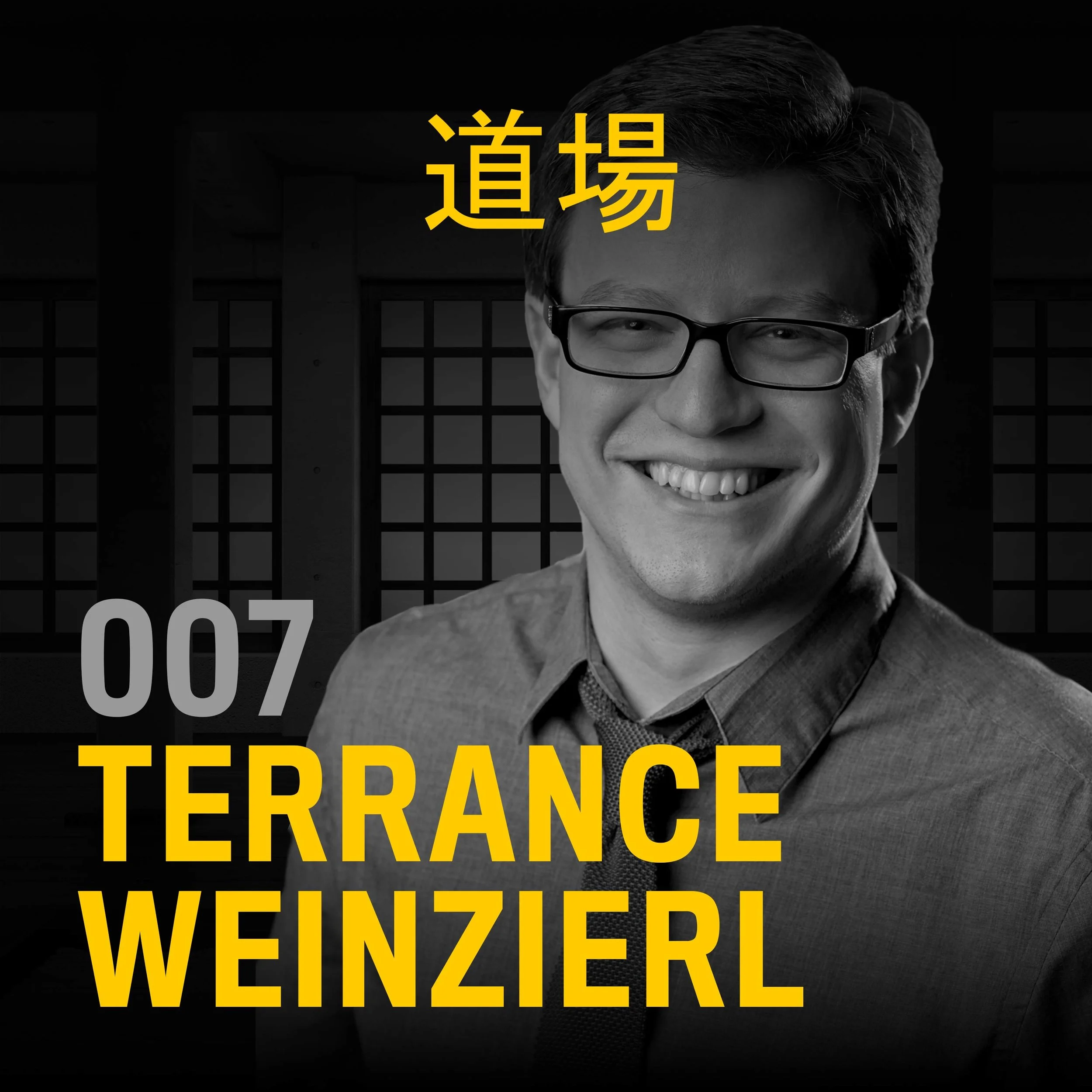
“Design as craftsmanship, or design as a practice or a discipline... it’s not easy all the time, and I think it’s like any other skills you want to develop. You have to put in the time and you’ll get better.”
Terrance reveals how he came to specialize in type, and show some development milestones along the way. Besides type design, he touches on calligraphy, lettering, and real-world applications like food packaging.

“I do consider writing to be a really essential form of design and it’s the words themselves as well as how they’re laid out on a page.”
Paul and I chat about Courier as the linchpin behind the scenes of Los Angeles typography. As the standard face for all motion picture and television screenplays, Courier's monospaced letterforms built the City of Angels into the entertainment capital of the world. While other businesses evolve their communication design past the hallmarks of the typewriter era, the movie & TV industries remain faithful to Courier and stay connected to Hollywood’s golden age.

“What typography does is communicate and connect and has such an ability to speak to particular time and place and speak to human experience.”
What is the future of typography, as our lives are becoming more digital? Gemma O'Brien is on the show from her studio in Sydney, Australia, and she will explore this question while we have a conversation about her philosophy behind the trend of authenticity in design and why she thinks the future of typography is human.

“It was kind of math and computers... not really design.”
In this episode, I chat with designer Steve Rachwal, who used to work as a typesetter at EllaType on Sunset Boulevard from 1985 to 1988 on the Berthold phototypesetting computer system.
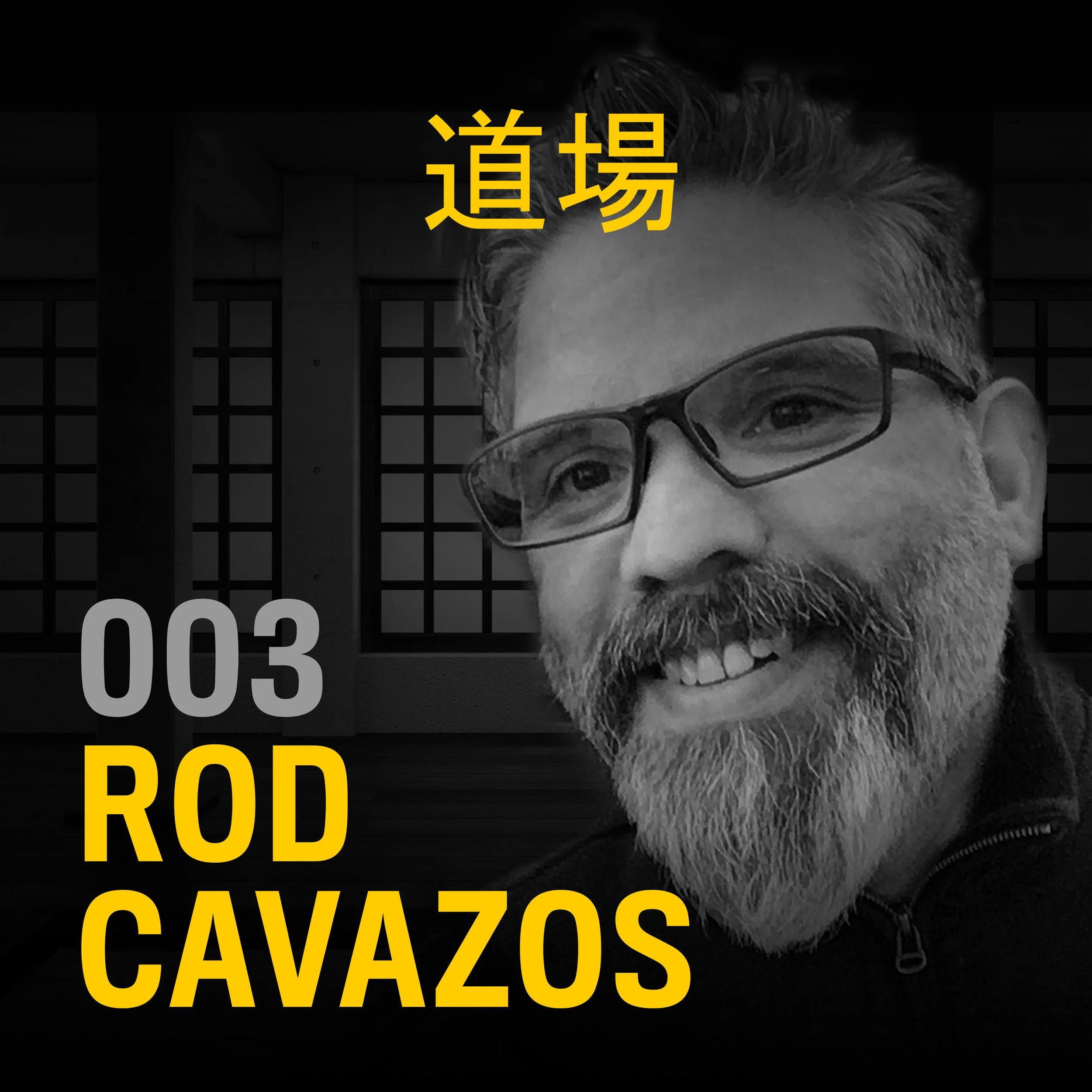
“Think of letters in terms of clay that you’re gonna sculpt. They don’t need to be fully sculpted before you jump them in to the digital side of things.”
In this episode, we chat with Rod Cavazos, Principal Type Designer at PSY/OPS, who’s created dozens of typefaces for top tier corporations and brands, schools and nonprofits, and even a couple of governments. Rod also has a quirky sense of play, and it is something he explores with obsessive delight.

“I’ve found a lot of beautiful typography is at tops of buildings where people don’t normally look, in back alleys, and manhole covers, which is one of my favorites.”
Nikki Villagomez is Graphic Designer and Creative Studio Manager at Dixon Hughes Goodman. She is also an avid letterhunter and the author of Culture + Typography: How Culture Affects Typography. She’s been scouring the United States seeking the clues that communicate the culture of a city through the typography of the city surroundings, evident in historical signage, ghost signs, manhole covers, and more.

I’ve been practicing graphic design for 14 years, and teaching interactive and graphic design for 18 years. And throughout this time, I’ve been wondering what makes good graphic design?
In design annuals and competitions, what do design juries look for? What about the typography makes a design piece great? Why do some agencies get more design awards than others?

“You have to be able to justify every single choice you make on a job.”
In this podcast, we discuss his typographic approach to retail design, spirits packaging, and food brand identity. We also talk about typography with purpose.