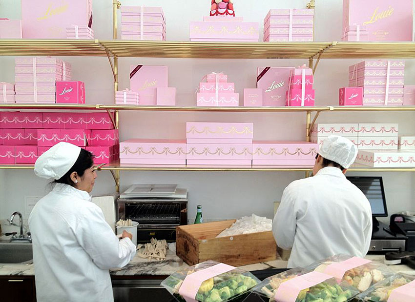
Bottega Louie is buzzing with energy before most other restaurants in downtown Los Angeles are even open. The 10,000 square foot Italian restaurant‐market‐patisserie commands a large presence from the street, but not solely because it looks like a palace adorned in marble and brass. The crowd is drawn in visually through large windows due to brightly‐colored Parisian macaron towers and an array of pastel boxes embellished with logos and tied with silk ribbons designed by Leah Faust.

We sit at a marble cafe table and watch people flock to the market counters, waiting to purchase jewel‐like packages of handmade marshmallows, glistening fruit tarts and gold flake‐adorned eclairs wrapped in luxurious paper, boxes and bags drenched in Bottega Louie logos.
“What makes Bottega Louie’s packaging so great is the surprising shifts in design aesthetic while maintaining the important details,” Leah explains after sipping her coffee. “To me, the pastel color selection and gold foil were the thread that solidified the brand language as the concept matured. Now splashes of saturated color are beginning to show up, which are beautiful. The brand has something for every taste.” Leah knows the brand well, as she was Bottega Louie’s Creative Director for five years.

Travel, food and beverage seems to have been accomplices to her love of design. At Hartford Art School, Leah studied painting but was completely engaged in graphic design as she traveled with a team of students to the New Urbanism community of Seaside, Florida to pitch a rebrand of their identity. She studied abroad at the Aegean Center for Fine Arts on Paros Island, Greece. There, she worked part time at a restaurant, and also landed her first freelance job there, updating the menus.
In 2002, Leah moved to New York City where mentors Brian Romero and Mike Essl challenged her to get better at design. She got acquainted with brand design while working on accounts like Stella Artois, Zac Posen and TAO at small firm in SoHo before going back to freelancing. Looking for a change of scenery, she moved to Los Angeles working under the name Faust Haus.
Although Leah has a BFA in painting, she doesn’t have a formal design degree. Her path to brand design began with an early passion for drawing, in early childhood. Instead of toys, she asked for letterform books. Her education encompassed applied tracing, making of letters, collecting handwriting samples… until she found true love in drawing scripts.
In 2007, she received a call from a neighbor referring a client looking for custom script type, and that client turned out to be Bottega Louie. The work at Bottega put all of her design, business and leadership skills to the test. She learned to articulate details and communicate in various styles across many departments while maintaining the tone of the brand identity.
Wow, you’ve been everywhere. I’m sure the travel has fed your creative juices. How does living in LA influence your work?
Travel is great. I am happy to say that because I was dealing with a fear of flying for about five years. But I’m back to planning lots of trips and it’s exciting.
Coming from New York where the style was so serious and restrained, Los Angeles is a great place to let it loose, let all things be an inspiration for design. Clients here have a more open minded view of styles and interpretations of concepts. Put bizarre colors and styles together to create a new style. Use history, symbols and iconography to communicate a modern message. Shoot your own photos. I meet fine artists, filmmakers, musicians with drastically different styles who are also finding a market in LA. I think we’re taking in all of the outcasts. It is a great place to be a working artist.
What was the initial direction for the Bottega Louie project, and what were your influences?
Without a doubt I was thinking of Louise Fili and her classic approach to branding in the F&B (food and beverage) world. I was also studying NYC graffiti writing to learning a more fluid approach to typography. Bottega’s owners were influenced by the experience in great dining halls of Europe, Parisian patisseries, New York City boutiques. We all loved hip hop and punk rock. It was a beautiful collision of aesthetics and influences. There was always the underlaying clash of counterculture and high society.

Inspiration/mood board.
The initial direction for the project included a developing the BL custom script which was then fabricated in brass and laid into marble at the entry on 7th Street. Design and manufacturing of packaging were also first, beginning to brand to market including grocers bag, pastry bags, pastry boxes, cups, napkins and come generic packaging.


Brass name on the entrance floor.


There were elements of the brand that had been developed by other designers before me. We found ways of weaving them together with the new designs. This helped solidify our approach—this was to be a brand with a sense of history. We wanted it to look like it was created by many hands over many years, woven together with a visual language we had not yet built.
I love the idea that the brand personality was built up over time, like a cafe that’s been in the neighborhood for decades.
Above all, research and development is what sets Bottega Louie’s concept apart. It was part of my job to understand all of the connecting pieces surrounding the concept and make sure they all felt like BL which took some study. I was fortunate to travel and take in as much information as possible through competitive research. The owner would remind us, “we stand on the shoulders of giants so we can see farther,” paraphrasing Isaac Newton. The design part was the easy stuff. We built it with help of conclusions from our extensive research.
How did you choose the primary and secondary typefaces that grace the packaging, menus, marketing and signage?
Bottega has more than seven logos and used more than 10 supporting font styles within the brand. I'll list them off for fun: the original custom Bottega Louie script, the custom Louie Triptych, The Business Logo, custom B.L. Monogram, custom Wreath with Monogram and the unreleased custom Graffiti Louie and custom Gin Script. I don’t want to give away all the supporting fonts but I will say that they include basic system fonts like Garamond, Arial and Edwardian Script—it’s all about how you use them. How did we choose the type? Our vibe that day and the product suite we were developing. It depended on the item, our inspiration and the research conclusions. But sometimes, like all great design, it was just a whim.

The logo development process


Leah's team, including
Danny Bobbe, Brooke Darrow, and Adam Tyler Brumley.
What's next for Faust Haus?
Faust Haus is no more. I’ve moved on to consulting as plain ol’ Leah Faust / LF. I specialize in concept development and brand experience for food, beverage and specialty goods. I help clients enjoy the process of defining their brand through a workshop consultation which gives insight into their concept before we approach branding and identity.
Right now I am working with several restaurants, a few new business concepts, collaborating with other talented consultants and getting involved in brand incubation. I have also decided to take on three pro bono projects per year and I’ve defined two of those… so someone has the golden ticket… more information soon.
We are proud to welcome Leah Faust as our guest instructor for a script letterform workshop called In The Loop. You can view more of Leah’s work at lf.leahfaust.com. Follow her on Twitter at @typograffiti.