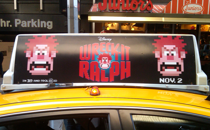
The Wreck-It Ralph promo atop a NYC taxi.

Wreck-It Ralph is a wildly popular Walt Disney animated film about a villain who's tired of being the ‘bad guy’ after 30 years inside an aging coin-operated video game called “Fix-It Felix Jr.” The film chronicles how Ralph goes off to explore other games in the arcade to heroically win a medal and earn the respect from the other game characters. Letterform artist Michael Doret designed the arcade-styled title treatment which helped to fuel the success of the movie.
If you aren't initially familiar with Michael Doret, let me fill you in. He is a graduate of The Cooper Union in New York City, founder of Alphabet Soup Type Founders, and an amazing master letterer. You've probably know his iconic work for the NBA, Major League Baseball, Warner Bros., Universal Studios, Taschen Publishing, Nike, Adidas, Time Magazine, TV Guide, Playboy, Capitol Records, Columbia Records, and all the major US advertising agencies. And although he is a highly-accomplished multi award-winning illustrator and designer, he’s also a very down-to-earth guy who likes to get his hands dirty on every project, including Wreck-It Ralph. Michael was kind enough to give us an glimpse at his development process for the treatment.
How did this project begin?
First I had a meeting with the creatives up at Walt Disney Studios Motion Pictures to discuss the basics of the project. My early inspirations were from looking at old video arcade game logos from the 70s and 80s. I found quite a few of them. That’s the feeling that they wanted me to go for, that’s what they were thinking. I didn’t really look at any one specific logo, or pull anything from this logo or that, I just tried to get an overall feeling of what the general look was of those had been developed at the time. You know, there was Bezerk, Bubble Bobble, Galaga, Frogger, Pac-Man, Dig Dug, Donkey Kong, Galaxian, the list goes on and on. There's so many of them.


What visuals did you first receive from Disney?
All I had been given at first, was a verbal description of what the movie was about. And then early on, they had some drawings of the character. I thought this character was going to start off as a 8-bit character, and then evolve into a fully-rendered character. I didn’t get all the details exactly, but it was quite enough for me to get started developing different looks.


Were there any versions that you felt strongly about?
There were several I could’ve gone with, but they eventually wanted to have some sort of representation of the character. I had several that went in that direction. There was at least a dozen or more directions I showed them at first. The more I drew, the more they realized what they wanted, and what they didn’t want.


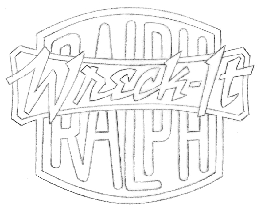
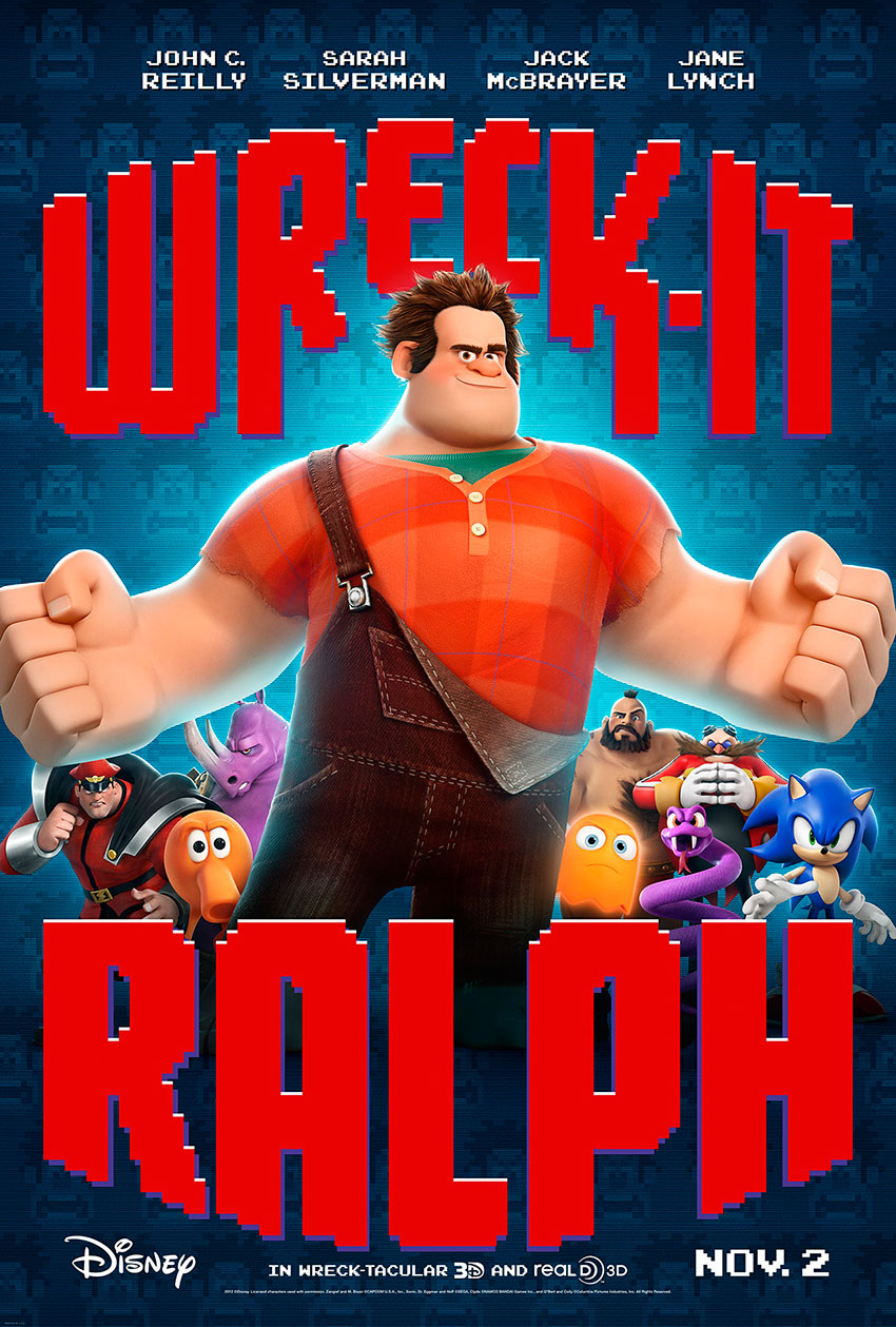
I start off for myself very, very rough—doing little scribbles, and then I see something in that scribble and do a little tighter scribble. So, I kept going that way and eventually I had a whole bunch of stuff to give to them. Some of those I developed a little further. Very quickly, some of them were dropping off, until we got to the ones with the very pixelated look. The sketch which eventually became the selected design began without Ralph’s head in the middle. The composition had “Wreck” at the top, “Ralph” at the bottom and between the two words was “It.” When it was decided that this was the chosen direction we rearranged the words and inserted an image of Ralph's pixellated head in the middle. Drawing the head was a little bit of a stretch for me because I know they are very picky about how their characters look. So, it took some work (with some help from Disney) to get it right.


Some of your work embodies nostalgia, do you feel that the Wreck-It Ralph logo does that?
Well, yes and no. The approach we took with that title treatment was very different for Disney. Doing a teaser campaign with just the title treatment and without actually showing the actual animated, rendered characters was a bit of a stretch for them—not the way they usually promote a film. Sometimes they even used just the head without the name. Even though the title treatment embodies a graphic approach that may contain vintage elements, I believe that it was conceived and used in a very contemporary way. Later on in the campaign Disney did break the title treatment in half, and insert some fully rendered characters from the film into the posters.


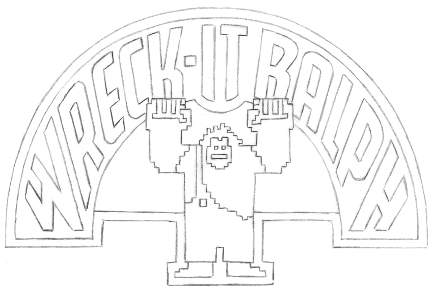
The final Wreck-It Ralph title treatment.
I think that a lot of my work does embodies a look that you could say is vintage, but I think that it just comes out of the fact that I’m doing hand lettering. I’m able to do certain things, like lettering arcs and doing certain things that used to be done when hand lettering was common, from the 40s and 50s. I have a lot of love for those older things. But, I don’t go out of my way to try to make it authentically vintage. If there’s a suggestion in there, that's fine. I don't believe I'm capable of fooling someone into thinking that “it’s an old logo.” There's a more contemporary sensibility to the work that I do.
So then, you weren’t trying to create a historic-looking logo?
It was just a starting point for thinking about it. There may be some elements that you might find in some of those, like the compositioning in some of those. But you won’t be able to go back to another logo and say “oh, that was the inspiration for the Wreck-It Ralph logo.”
By the way, they don’t call it a logo, they call it a title treatment.
Do you play video games?
I have played games at times, but I just don’t have the time to spend on things like that. I never really got involved in video games. You really don't have to be involved in video games, it's a visual problem to reach a certain audience. That's what we do as designers.
Yeah, you’re right. Were you involved in any brand identity or style guide development?
Once it goes into a big organization, you give up hope in trying to control anything. The creative director I worked with tried to keep a tight reign on things, but at a certain point it just gets out there.


Ralph's head, shot from the billboards in Times Square.


I’m sure in the field of entertainment, timing is everything. What was the most enjoyable part of the process?
Actually, the most enjoyable aspect of this project was just to be able to work with the creatives at Disney who really understood and “got” what I do, and were able to allow me to be as inventive as I could. Too often I’m restricted by concepts and ideas that don’t allow me to realize the potential of what might be possible in any given project. But these people at Disney pushed me to go a bit further than I might have already gone. In my book, that’s what makes a project enjoyable.
What else is coming up for you?
I’m working on some postage stamps for the U.S. Postal Service which are based on seed packets of old, American fruits and vegetables. I’m also in the final stages of development on another font that I’ve been working on. I’m also designing a title treatment for another Disney film that’s in the works.
Thanks Michael, I can't wait to see what comes next. If you’d like to see more of Michael Doret’s work, read his stream of consciousness at michaeldoret.com.